If you’re nervous of BOLD colour and bored of grey, beige and taupe, the new Pastels are your answer. Don’t think I’m talking about the pastels from the 80’s like peach and seafoam green. The new pastels are still saturated with true pigments, slightly muted and full of life without being overly sweet.
Imagine a sandy beach in Bermuda, with its muted sand, various stones and foliage back dropped against that gorgeous blue ocean. Now you’re getting my drift…The fresh and contemporary way to use pastels is to ground the various colours with natural materials like washed wicker, natural white oak, ash and walnut flooring, linen and wool material.
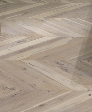
Photo Source: Wideplank Floors
I think of the sophisticated, powdery and soft colours which I saw on one of my many trips to the precious city of Florence, Italy and Rome, a City with many treasured design inspirations. These colours are not dated, they are not tired, they are eye-catching and comfortable to look at..and clearly timeless, since they have been there for hundreds of years.

This is a picture of me at the Vatican…look at the pastel colours which adorn this space…everything is soft , yet bold, nothing is too imposing or too brash.

This image is from the gift shop at the Uffizi in Florence, an illustration of the variety of colours’ perfect collaboration that pastel colours together can bring to your home.

The collection of cups and plates from Crate and Barrel display a beautiful compilation of pastel colours which can seamlessly blend into any décor.
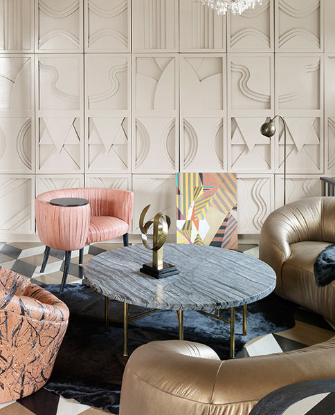
Photo Source: Kelly Wearstler
Kelly Wearstler is my Design Crush. I admire and respect her work ethic, design expression and sense of natural style. She uses the pastel colours in a fresh and bold way, taking shades which used to be attributed to a Snowbird’s condo in Boca, and making them hip and modern.

Photo Source: Kelly Wearstler

This room would make me cringe if it was not for the simplicity of the post modern sensibility brought in by the graphic area rug, the wood floorlamp and classic tuxedo sofa.
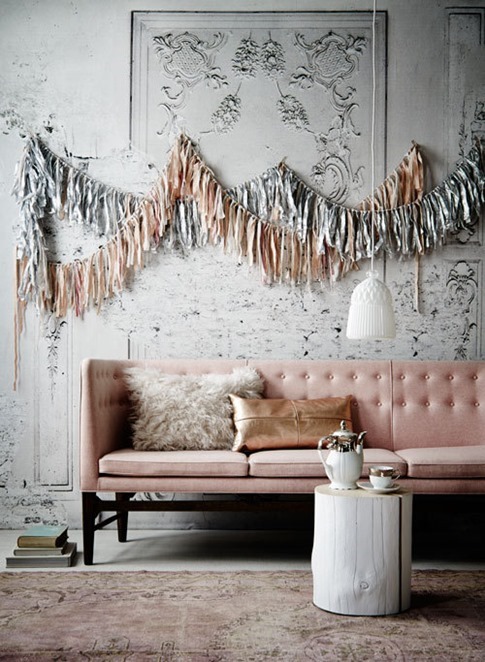
This image is somewhat ‘expressive’, but you get the idea, keep the sofa classic and non-frilly, add some metallic and a touch of contemporary wood finish and you have a pastel look which is neutral, embracing both masculine and feminine expressions.
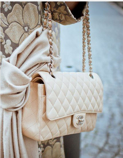
Pastels have had a bad rap in the past..perhaps it was the sweet and over decorated way they were used. Keep it subtle and simple, don’t add any frills, geometric shapes and metal accents will give a contemporary edge to the look. After all…if Chanel can do it, so can you.
Latest posts by Evelyn Eshun (see all)
- Evelyn’s Double Take: Floating Double Vanities - April 26, 2026
- Double Take: Exterior Color Schemes - April 26, 2026
- Contemporary VS Rustic Decor - April 26, 2026

