
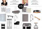
The Challenge: We asked two designers to create a room concept inspired by gorgeous rugs from BOFT Fine Rugs!
Warm, Stylish Home Office by Isabelle Boba
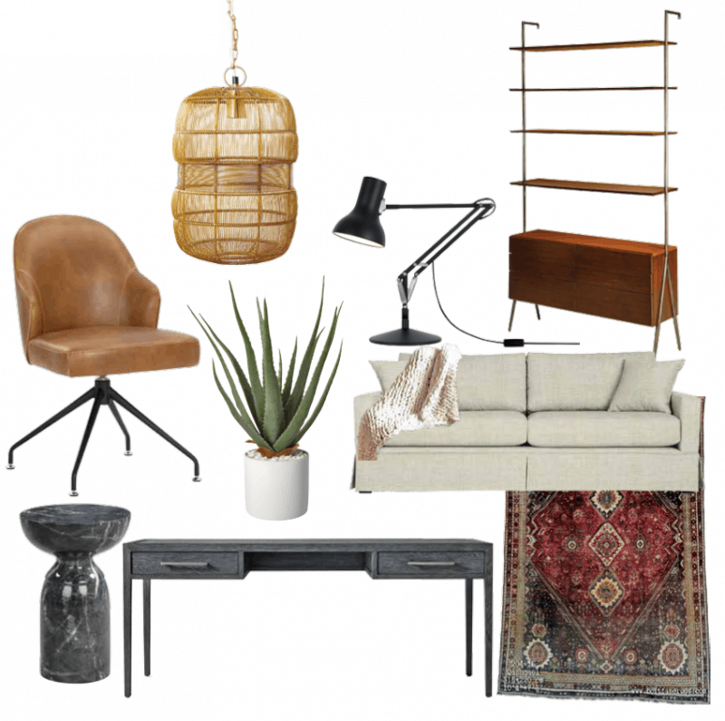
Work from home in a space you want to spend time in! For this home office, we looked to foster warmth and comfort while conveying a sense of luxury and style. We added textiles throughout the room to create a cozy feeling, covering the floor with an area rug and adding thick handknit throws. Textiles are a fantastic way to add warmth and comfort to any room and a stylish home office is no exception. The throw rug offers a classic, luxurious look along with that soft, plush feel under foot while you’re sitting at your desk. – Click here for more details and complete sources!
Laid Back, Modern Living Room by Jenn MacDonald
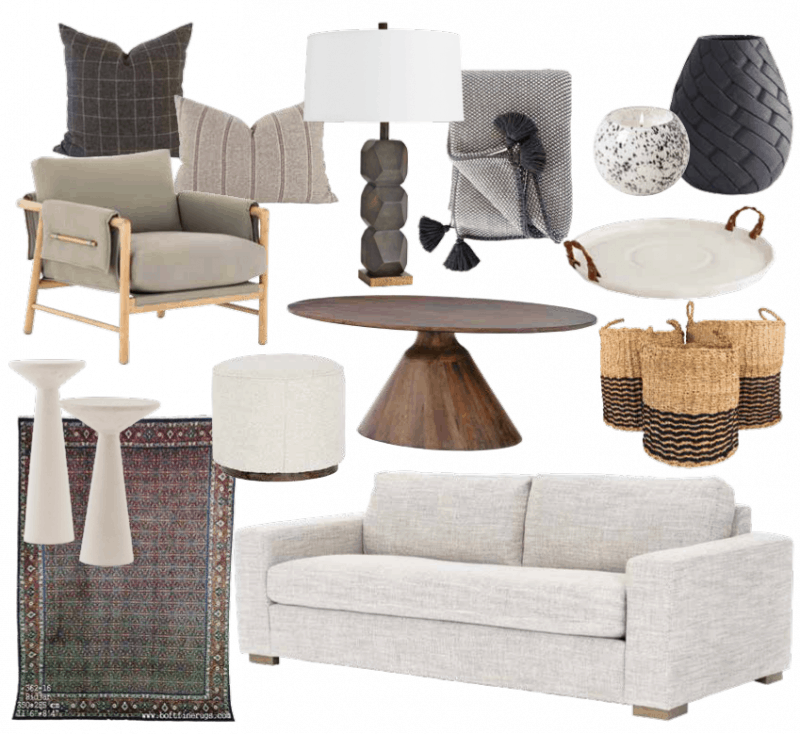
Layering light, neutral items over a darker area rug with warm tones like brick and olive makes the space feel restful and calm. The pattern and colors in this area rug offer the perfect base for a living room full of natural finishes and neutral materials and grounds the space with a subtle touch of drama! – Click here for more details and complete sources!
Latest posts by Canadian Home Trends (see all)
- 2026 Design Trends: The Evolution of Home Design - April 1, 2026
- Expert Bathroom Design Secrets from Canada’s Best - April 1, 2026
- Treasure Hunting: Discovering Unique, Locally Made & Vintage Home Décor - April 1, 2026



I always like some from both rooms but if I have to pick one will go with Jenn MacDonald
I picked it because it looks so comfortable
I am drawn to the office design as it is the most practical during this pandemic.
Love both but I have to pick Jenn MacDonald. I felt it was cozier, and suits my lifestyle more!!
Love both designs – but was especially drawn to the area rug and other pieces in the office layout.
I like the cool colours of Jenn MacDonald’s design.
I picked the office design because I prefer a warmer, more inviting, colour scheme
The living room looks like a nice place to read 🙂 Thanks!
The first thing that stood out to me was the rug design used by Isabelle Boba. I’m very fond of oriental designs, and it really swayed my choice.
I voted for Jenns because I liked the style of furniture. I think it would be more comfortable to live with.
Both lovely designs but I believe Isabelle’s is more business like while keeping the comforts of a living room and WFH. The Rug ties everything together. Warm and functional – very nice
I voted for Jenn McDonalds because I love the colour choices and the cozyness.
I really love the rug in Isabelle Boba’s design.
I like them both, but a couple items in top design I don’t like.
love both of the couches
I liked the colours used and all the different textures. Even though the pieces were very different, it all blended great together.
Thank you for these design inspirations! Both are beautiful.
I look forward to my new living room!! IMMA WINNER!!
It’s the lamp that Jenn MacDonald picked. I’m not a fan of wicker
I liked the desk better in design one.
I love the look and feel of Jenn’s picks.
I voted for Jenn MacDonald because I liked the use of grey tones. The accent pieces were also more appealing to me.
I like Jenn MacDonald’s room as it looks cosier!
I like the living room by Jenn MacDonald because it looks warm and cozy.
I loved the neutral colours and the baskets.
I love the casual style that would easily fit in with decor.
I liked the colors as well as the comfy looking chair in Jenn’s room….but i also liked the rug from the other room for a splash of color!
It is more lay back! It’s how I like to style my home.
I like the darker tones and the side chair looks so comfy
SO laid back!
Laid Back, Modern Living Room by Jenn MacDonald I picked because it looks so comfortable
I like the Laid Back because she uses a lot of natural products.
I voted for Modern Living Room by Jenn MacDonald because it is clean and the colour is so easy on the eye.
It was a toss-up, and frustrating since they are for two different spaces. It was the light fixture that would attract so much dust in Isabelle’s that made my final decision to vote for Jenn’s.
I like the wood features better than the metal
I really like the unique shelving unit of the first one.
Great design elements for both!
I just really liked the items in Isabelle Boba design. I could see them fitting into my decor very nicely.
Love Jenn’s colour combination
Isabelle’s has the simplicity of a vintage room.
I like the colours in the modern living room.
I like elements of both, but I love the warm tones and airy furniture of the home office board!
Great work by both. I prefer Jenn’s board as it’s more my taste.
I choose, Jenn MacDonald’s layout because I liked the furniture she selected for this room.
I like Home Office by Isabelle Boba because of the warm colours.
I’m completely amored with the warm, stylish Home Office by Isabelle Boba!
Love how the colour palette is more subdued and gives a cozy feel.
I chose the Jenn MacDonald Laid Back, Modern Living Room room because I really like the natural finishes and neutral materials she chose for the room, it’s warm and inviting.
I prefer Jenna’s design because the furniture looks more comfortable and more like my style.
Prefer the design style of Jenn MacDonald
absolutely love the accent chair in Jenn MacDonalds Design room
Love the mid-century vibe that Isabella has going on.
Love the laid-back look! That’s the one I’d pick for my home.
I picked Jenn’s because it looks super cozy and comfy
Boba’s carpet… love the rich red.
I love the nod to mid-century in both but I prefer a more traditional office space.
My vote was for the living space with its textures and warmth.
They are both great , but I like the extra storage on the Boba design.
It just speaks to me more.
I like the warmer colours in Isabelle Boba’s design.
I really like the room that Jenn MacDonald has pulled together. Feels like home to me.
I love the things from the 60’s and I’m getting that kind of vibe from Isabelle Boba’s room.
Mishelle G
Just love the picks for this lovely living room.
Laid back👍😎