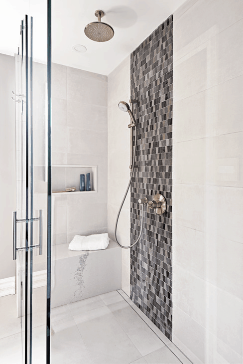
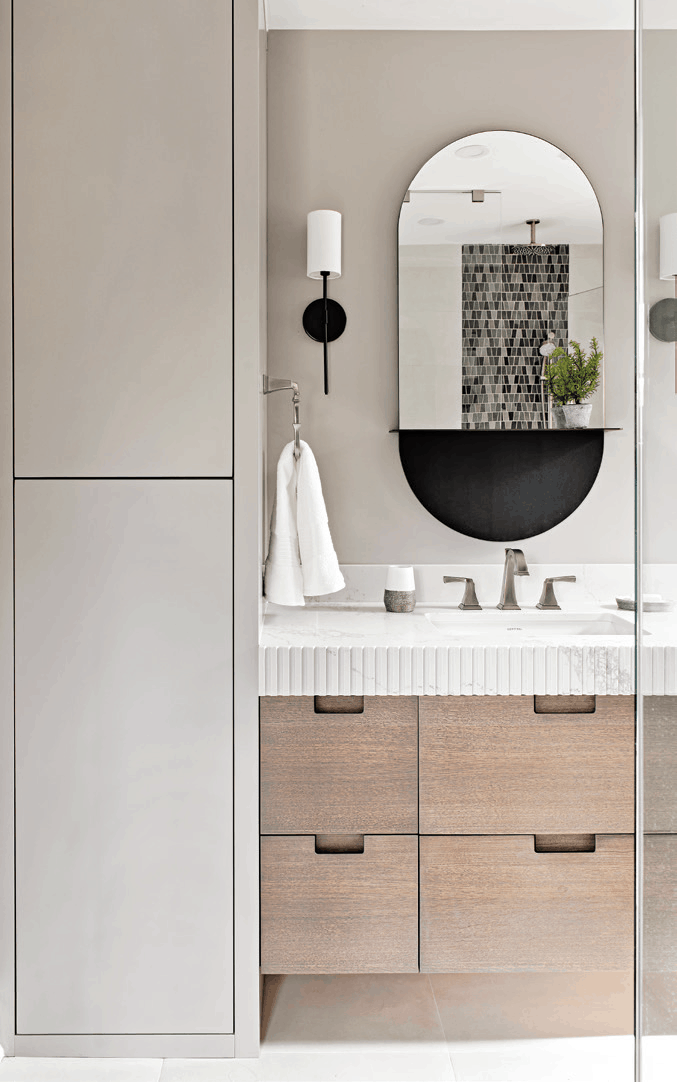
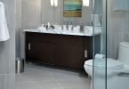
We love the warm toned, white oak, stained vanity in this space. Its fluted stone top detail makes for unexpected visual interest. The sleek design of the linen tower, painted the same as the walls, helps to minimize visual clutter in the space, allowing the blackened marble accent tile in the shower to really steal the show. – Gabriele Pizzale, www.pizzaledesigninc.com
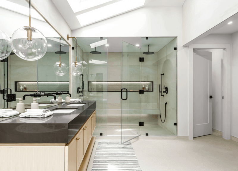
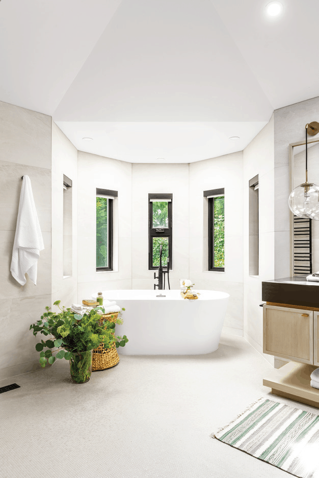
We extended the shower to what used to be a toilet area and created a double shower with a long bench along the back wall. The toilet was positioned into a wet room with privacy door. We switched the drop in tub with a freestanding unit with a view of the garden when bathing. The color scheme is kept natural and organic while the design of the cabinetry is simple with minimal details to make the space feel calm and collected. – Negar Reihani, www.spaceharmony.ca
Photos by Colin Perry
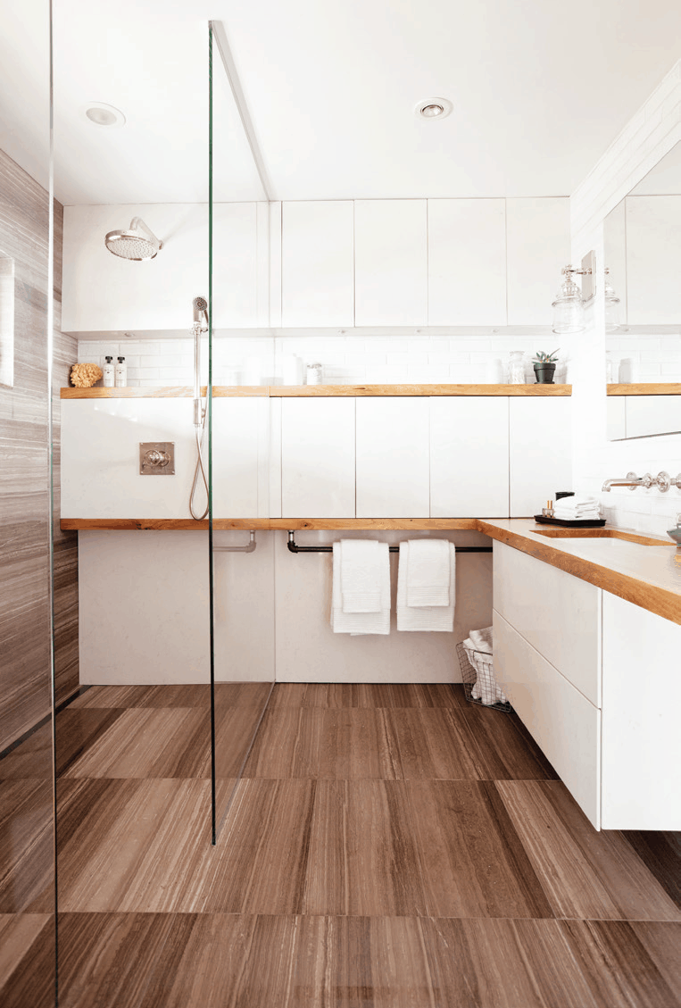
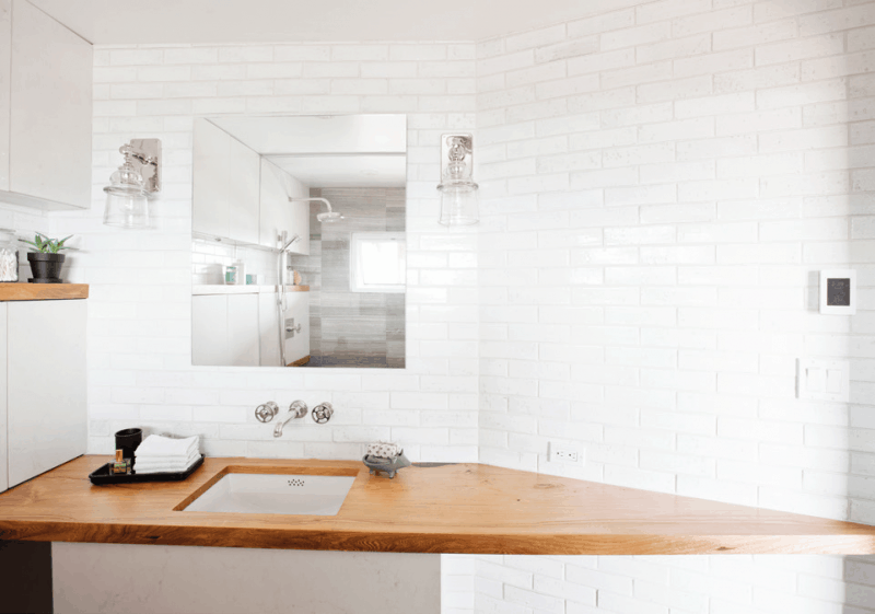
Located in the treetops of Lions Bay, it was important that this space gave a nod to the natural surroundings of the home. To make the compact space feel larger, we wrapped a contrasting wood detail from the vanity into the shower that pulls the eyes left to right. We also wrapped the floor tile up the wall to form a visually larger space. The position of the window was key to not only add natural lighting to the vanity but also capture the perfect view of passing boats. – Jamie Banfield, www.jamiebanfield.ca
Photos by Janis Nicolay, www.janisnicolay.com
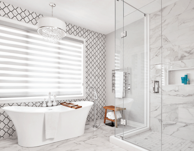
Before the renovation, this home had a lot of real estate that was not used to its full potential. Previously, the shower was a small, dark space that felt more like a tight closet. By creating a better layout and selecting a glass shower surround to allow the light to travel through the room, the washroom became an inviting, spa-like space. – Tina Singh, www.lionsgatedesign.ca
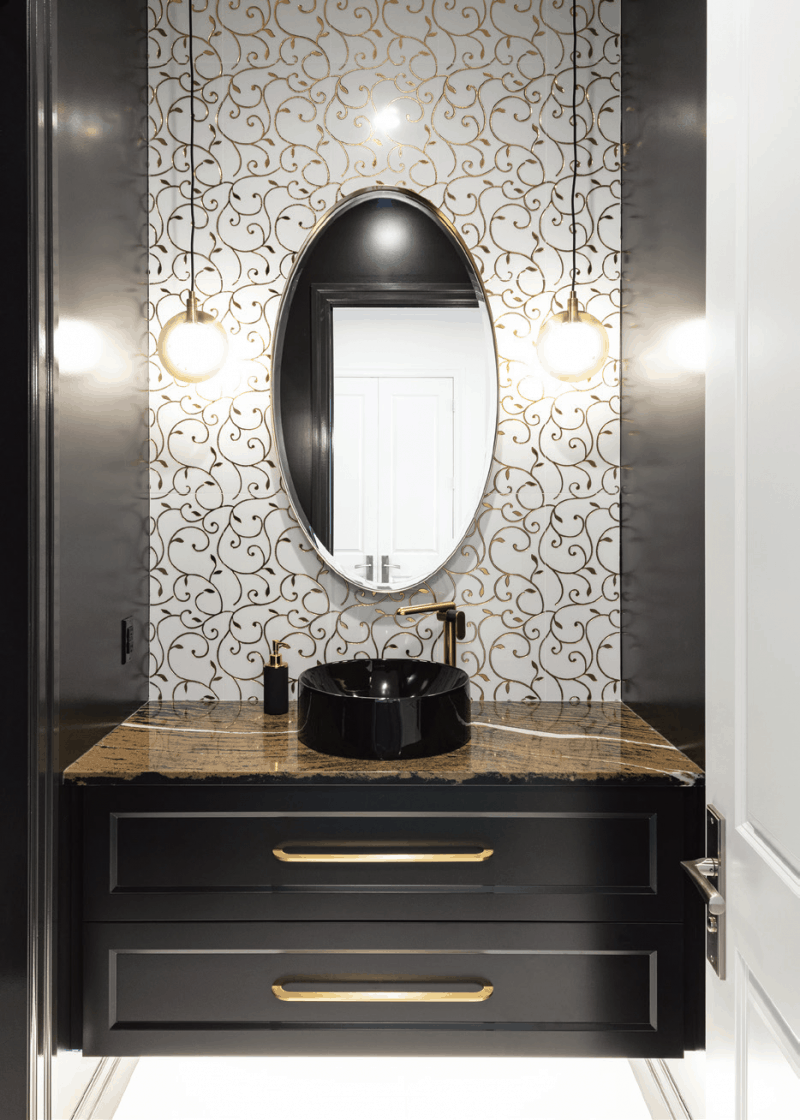
In this dramatic, sophisticated powder room, gold orb pendants, a stunning Golden Dragon Cambria quartz countertop and a glitzy gilded backsplash tile make a bold statement against glossy black walls. The ornate curvy floral motif adds visual interest against the clean curves of the gold mirror, round vessel sink, sleek faucet and cabinet hardware. – Jillian Straky, www.housewears.ca
Photography by Joe Symchyshyn, www.symchyshyn.com
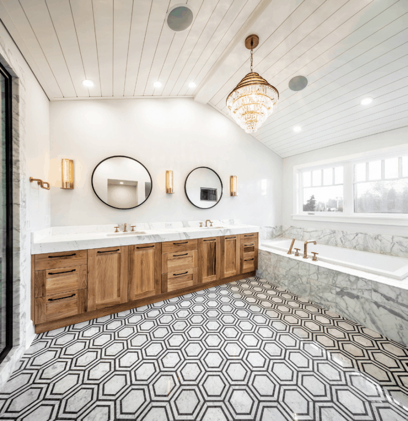
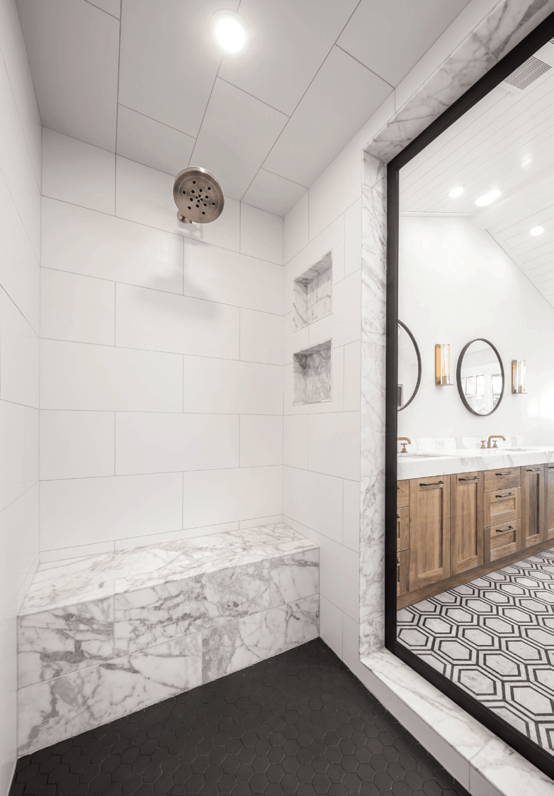
This spa-like ensuite is located in a 100 year old home. When designing the space, it was important to offer modern functionality and style while maintaining the original aesthetic of the home. With a black framed shower, a heated soaker tub surrounded by marble and a bleached walnut vanity, this bathroom truly is as timeless as the home that holds it. – Allenbrook Homes, www.allenbrook.ca
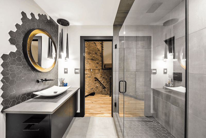
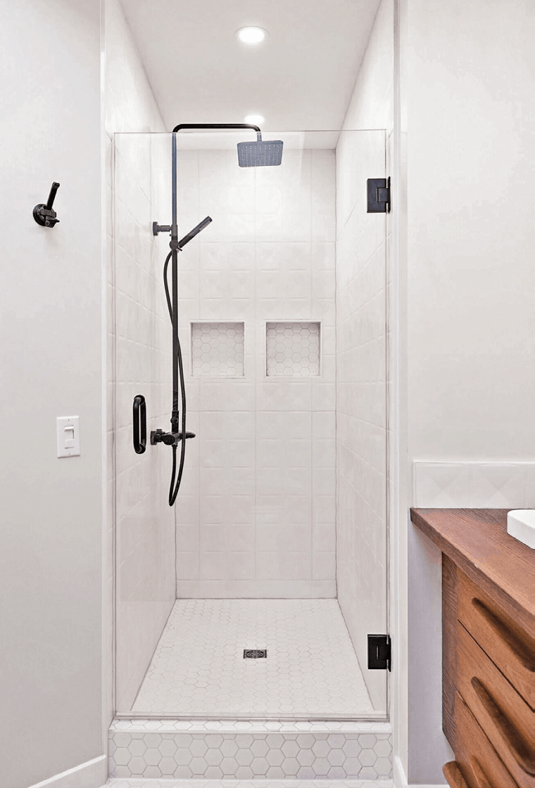
This space was created to suit the homeowner’s masculine style. The borderless hex tile backsplash is such a bold statement and creates the modern, elegant yet rustic look that we had aimed for. We incorporated hex tile in the shower floor and niche as well to flow with the backsplash and the rest of the space. What a change! – Susan Jomha, www.distinctinteriordesign.ca
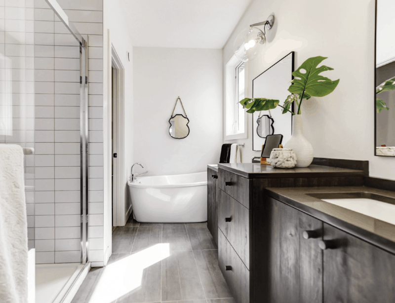
Blending function and relaxation, the layout of this bathroom offers a smart use of space. Scandinavian style cabinets have been finished in a darker stain that is not typical of that style. This results in a stunning and unique look. Creating show stopping style is a great way to set your property apart, regardless if you are selling it or enjoying it. – Jill Turgeon, www.stageandsell.ca
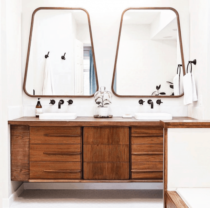
This early 2000’s bathroom ensuite was completely transformed into a fresh, Mid-Century Modern space. This bathroom was your standard builder-grade ensuite that had been worn down over the years. We were able to upcycle a Mid-Century Modern dresser into an updated vanity that fit the style of the space. The wood and black accents were key to ensuring the bathroom kept its warm feel. The mirrors completed the look with their unique shape and color. – Referbish Renovations, www.referbishrenovations.ca
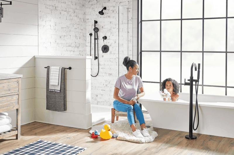
A freestanding tub filler is the perfect statement piece to complement your gorgeous freestanding tub! Available in a variety of styles and finishes, there is a tub filler available to match any design aesthetic you may desire! The Gerber Contemporary Tub Filler, shown here in Satin Black finish, is a fantastic example. The modern yet timeless look of this piece brings an air of sophistication into any space. Matching the finishes to other pieces in the room, such as the shower and vanity fixtures, creates a elegant, coordinated feel. Square and Traditional styles are also available, allowing you to select the best look for your bathroom. – Bartle & Gibson Showrooms, www.bartlegibson.com
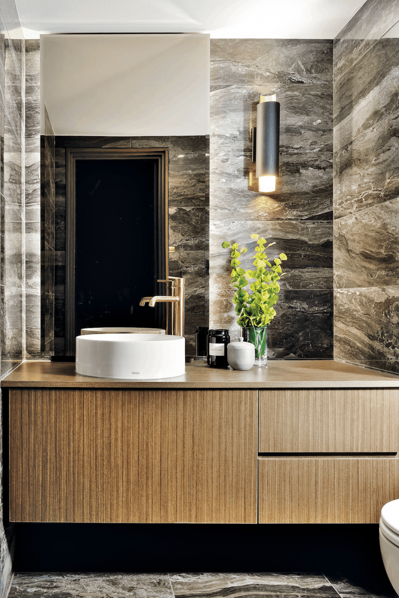
Tiny rooms like the powder room are the perfect space for a dramatic and bold statement. Black marble tiles, a floating vanity in warm wood tone, and a contemporary vanity light fixture completes the look for this project. – Red Barrinuevo, www.redesign4more.com
Photography by Arnal Photography, www.arnalpix.com
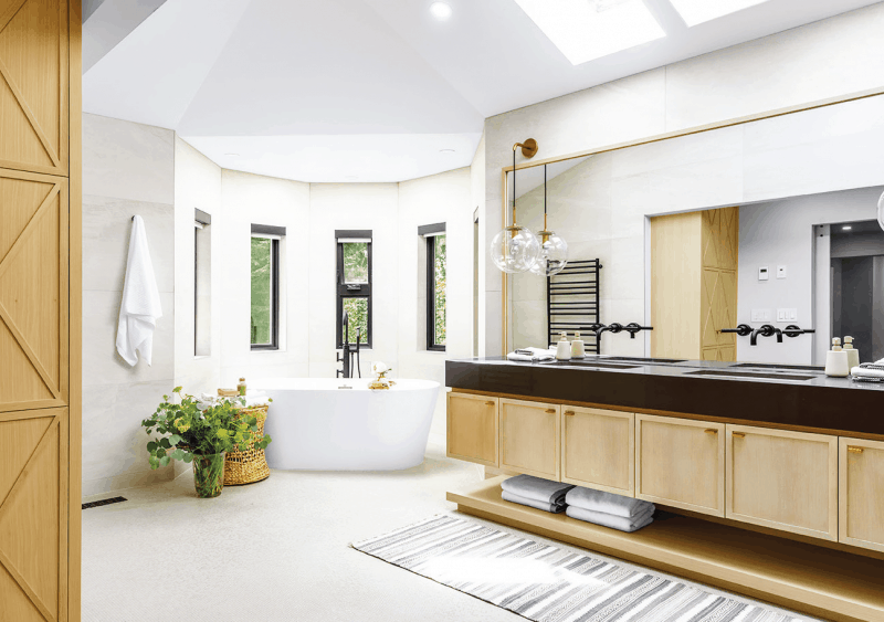
This large home had great flow, beautiful high ceilings and an abundance of natural light. We reinvented the interior of the home, including this gorgeous bathroom, with a modern farmhouse style that would work perfectly with the existing features of the house. – Negar Reihani, www.spaceharmony.ca
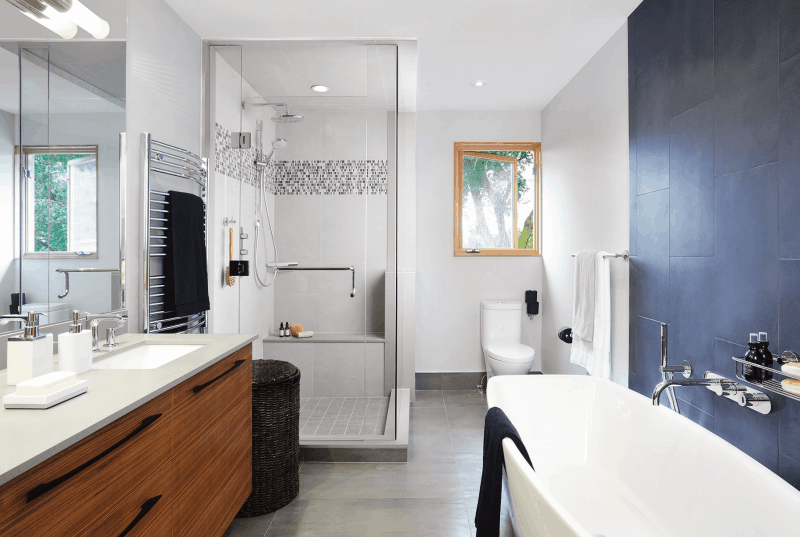
As a designer, it is always an honor to be called back to a home by a client who enjoyed working with us years ago. This was one of those projects. We were tasked with refreshing a bathroom which was built in the late 90s. The goal was to make it functional for their young son and as a main bathroom for guests. The space had to be gender neutral, functional, safe and accessible. We added storage within the wall cavity, moved the tub to create a separate bathing opportunity and included a large shower with a minimal curb and safety features such as the textured mosaic porcelain floor, bench seat and easily accessible faucet controls. – Evelyn Eshun, www.evelyneshun.com
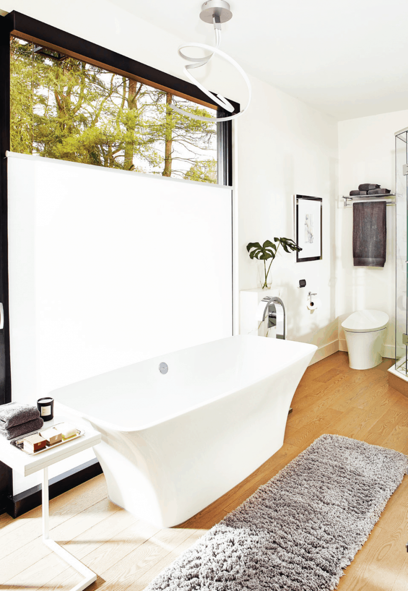
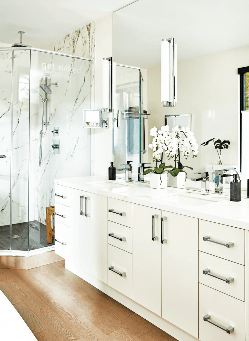
My favorite design element of this master ensuite is the incredible view through the floor-to-ceiling glass walls. I chose porcelain for the walk-in shower and double-sink countertops. Porcelain is a durable material that mimics a classic Carrera marble but with non-porous, anti-bacterial benefits. I chose modern vanity lights mounted on the mirrored wall and a funky chandelier above the tub to illuminate the space in a soft sexy light. I can raise or lower the blinds by remote control to just the right height for privacy. – Jackie Glass, www.jackieglass.ca
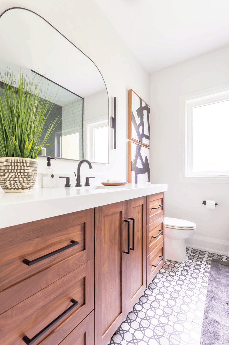
This gorgeous modern bathroom was a renovation for two teen girls that would double as a guest bathroom. I was beyond excited when they chose that incredible patterned tile for the floor. What a statement! We were able to save on costs by keeping the original plumbing and we opted for more storage by adding a larger vanity and shower niche. – Jacklyn Harper, www.jaclynharperdesigns.com
Carpentry by The FoxwooD Group Inc. www.thefoxwoodgroup.ca
Photography by Cameron St. www.cameronst.com
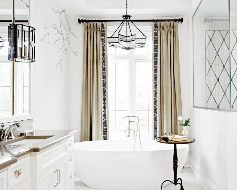
This master bathroom design really provides a sense of zen. The beautiful soft curves of the freestanding tub paired with the delicate hand-painted cherry blossoms on the walls are just two of our favorite design elements of this space. The intricate custom cut marble inlay in the shower adds a uniqueness, and we love how the beveled mirrors over the vanity add a touch of glamour. – Gabriele Pizzale, www.pizzaledesigninc.com
Photography by Mike Chajecki, www.mikechajecki.com
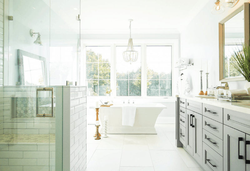
This bathroom was all about the natural light and spa light appeal. You walk into the space and feel like you’re walking into a retreat. Immediately, the focus centers around the stately freestanding tub and big beautiful window. Everything in this space has an ethereal type appeal that immediately allows you to relax upon entering the bathroom. – Kate Campbell, Kate’s Contracting Inc, @KateBuilds
Photography by Zach Bird Photography, @zachbirdd
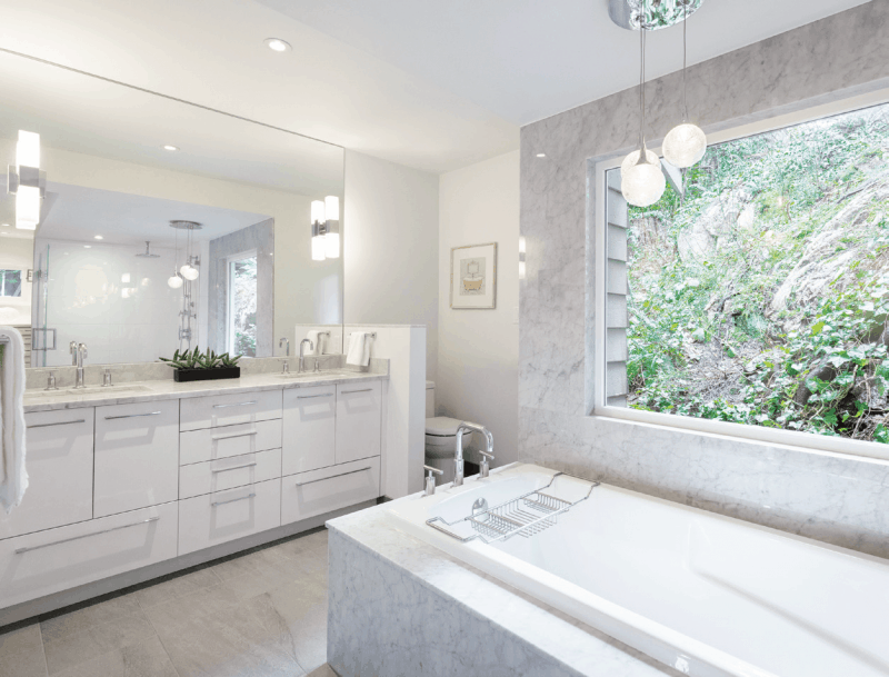
Taking advantage of the steep sloped site, we brought in the natural surroundings of this west coast park like property while creating a tranquil contemporary master ensuite. The warm colors and materials formed the backdrop for the natural surroundings. This bathroom was opened up and transformed to be a more functional and spacious relaxing spa experience. The large and private window created the focal point in this space, allowing for natural light to flood in. This master ensuite is the ideal space to start your morning with bright natural light and end it in a relaxing spa. – Alice Milne, www.synthesisdesign.ca
Photography by David Sutherland Photography
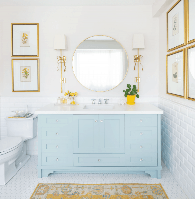
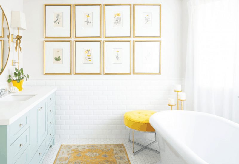
The inspiration for this bathroom renovation started with the fourteen karat gold framed botanicals that surround the room. I bought them during a trip to High Point Market one year. My wall sconces were next and then my fabulous, so comfortable DXV bathtub. I chose Benjamin Moore’s Wythe Blue HC-143 for my vanity because it’s one shade darker than my bedroom wall color (Benjamin Moore HC-144 Palladian Blue). The colors in this room create the perfect flow from my bedroom and this room is a sanctuary where I start my day. When people tell me they don’t bathe, I now know that it’s because their room is not beautiful enough. I hadn’t bathed in years because my bathrooms were outdated and uninspiring to be in. – Maria Killam, www.mariakillam.com
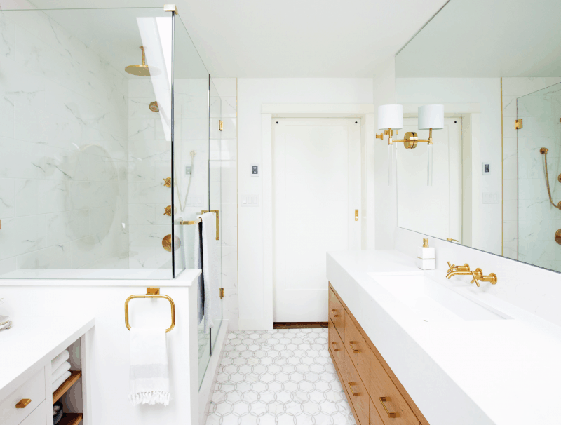
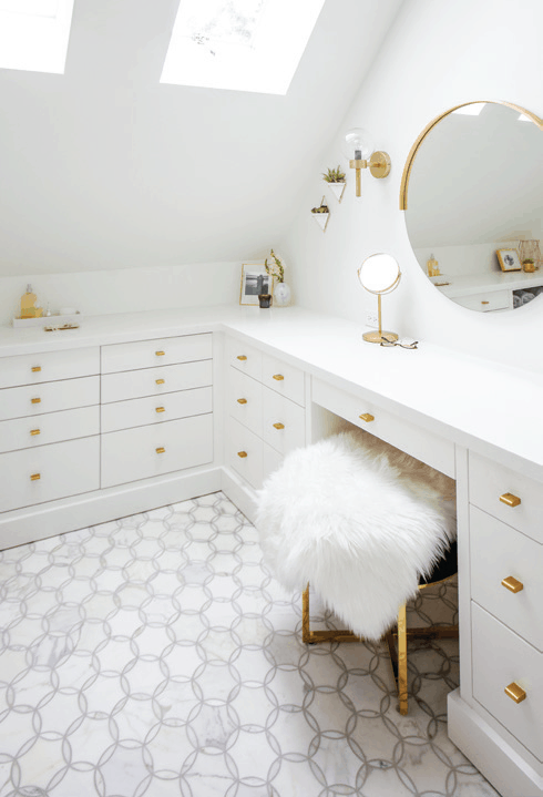
This bathroom was another remodel of an ensuite. We worked really hard with the awkward layout of the room to design a bathroom that was perfectly suited to the needs and lifestyle of this couple. The bathroom features a beautiful two-person shower and stunning custom vanity with brass plumbing fixtures. The makeup desk houses custom storage for hair appliances that allow them to stay plugged in, jewelry and makeup storage. – Lisa Moody, www.grapevinedesigns.ca
Latest posts by Canadian Home Trends (see all)
- 2026 Design Trends: The Evolution of Home Design - March 24, 2026
- Expert Bathroom Design Secrets from Canada’s Best - March 24, 2026
- Treasure Hunting: Discovering Unique, Locally Made & Vintage Home Décor - March 24, 2026

