
The Challenge: We asked two designers to create dining room concepts featuring the Sirius and Sirius Minor collections available from Living Lighting. One designer was asked to create a luxury dining space for a custom home using Sirius while the other was asked to create a glamorous space for a small condo using the smaller Sirius Minor.
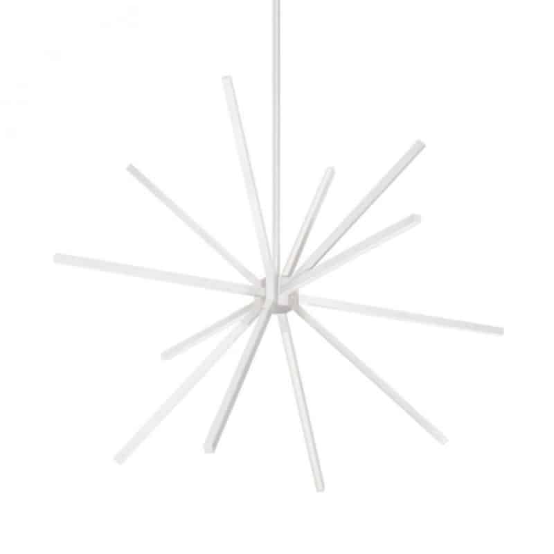
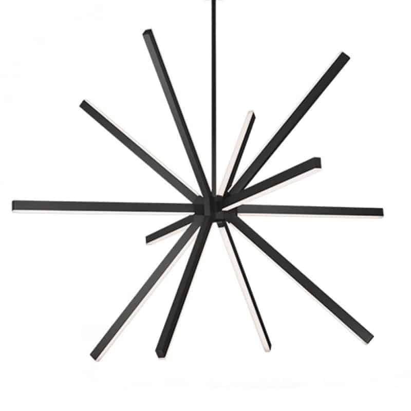
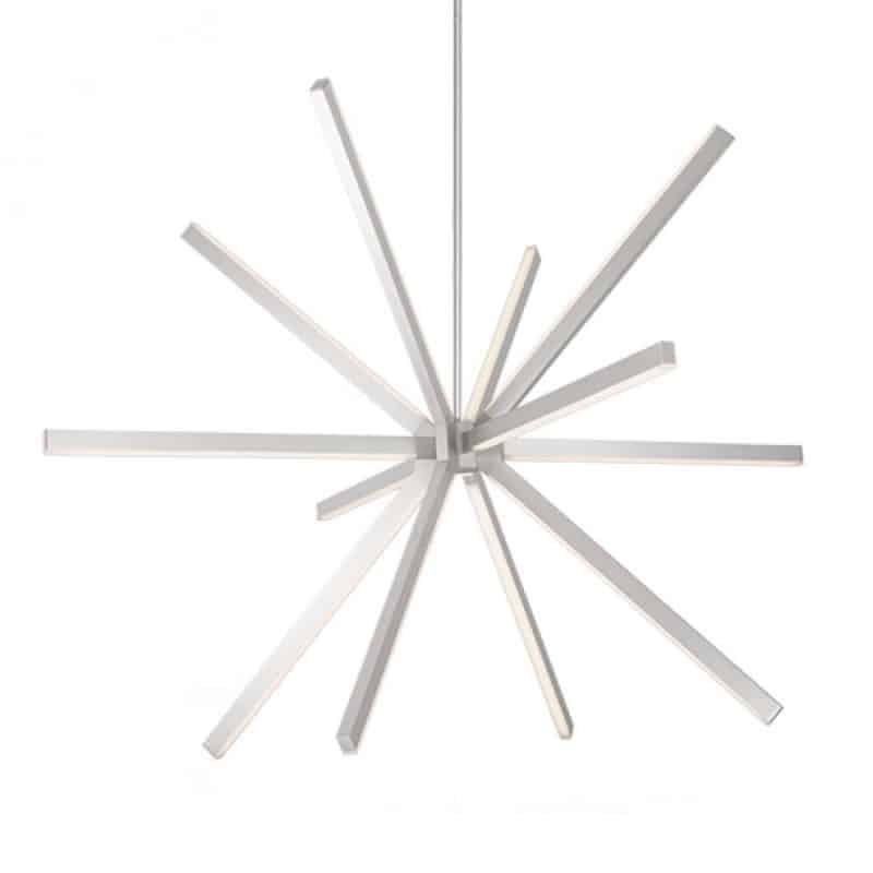
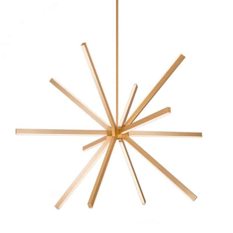
Sirius and Sirius Minor: Sirius is a visually stunning LED fixture that looks like a starburst of light, perfect for a contemporary space. The fixture is available in two sizes (48″ and 54″ wide) and four stunning finishes; black, brushed nickel, gold and white. Sirius Minor is a scaled back version of this stunning fixture, only 32″ wide with thinner lights, making it perfect for adding the stunning contemporary flair even in a small space!
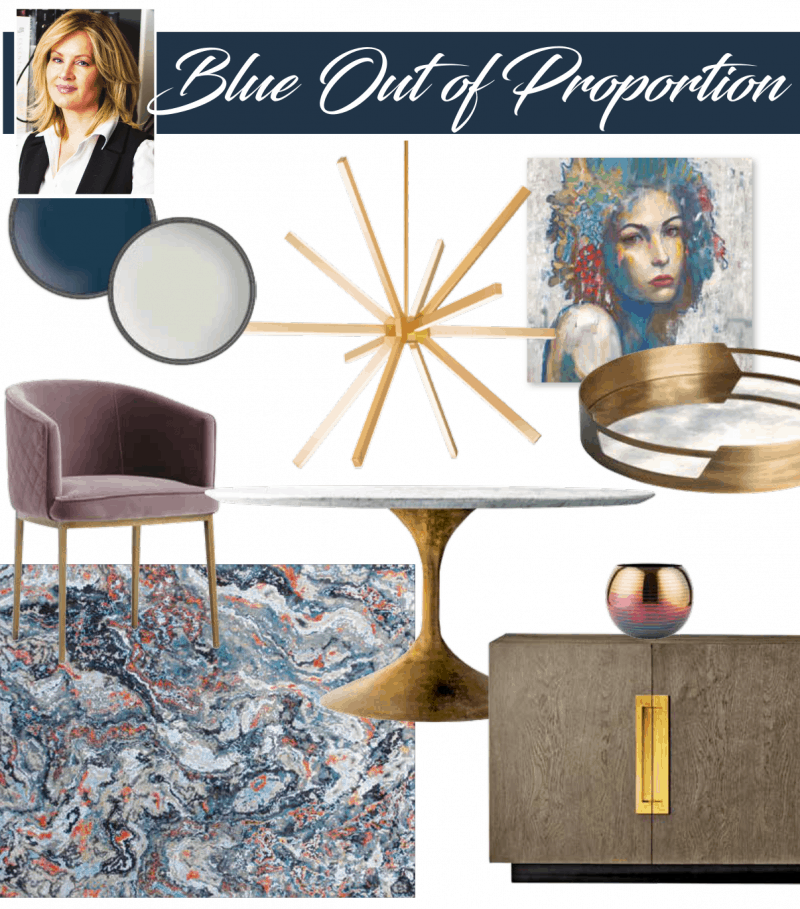
Blue out of Proportion: Our luxe custom home dining room challenge was tackled by Designer Jillian Straky who choose to pair the Sirius fixture in a stunning gold finish with deep, dramatic colors for a look that is sophisticated with a bohemian flair. You can see full details and sources here.
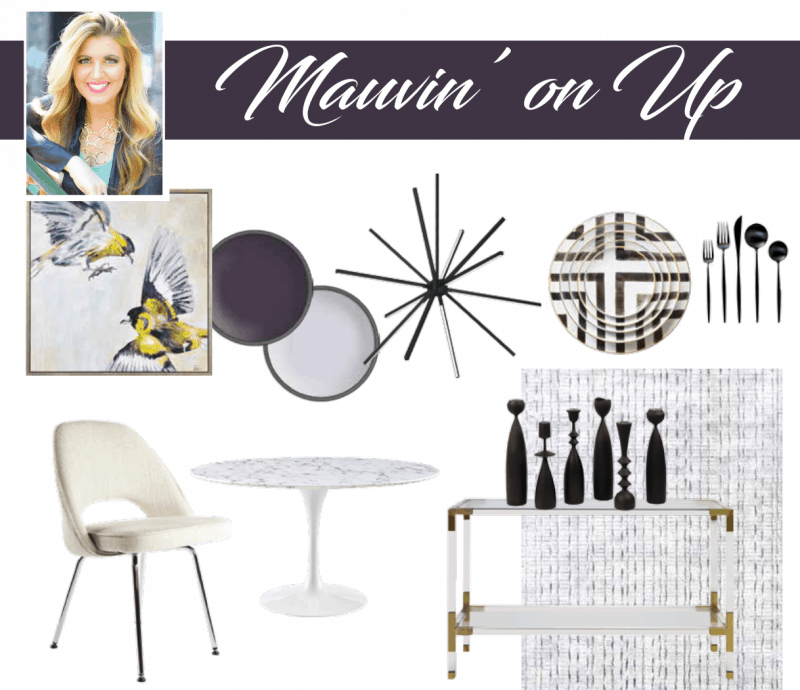
Mauvin’ on Up: Designer Dvira Ovadia tackled the challenge of creating a stunning condo-size dining space with a light and airy design concept that integrates hints of bold color and a stunning black finish for the Sirius Minor fixture. You can see full details and sources here.
ENTER TO WIN:
Vote for your favorite design board for a chance to win! One randomly selected participant will win their choice of either the Sirius or Sirius Minor chandelier in the finish they prefer, courtesy of Kuzco and Living Lighting. *
*Open to Canadian Residents over the age of majority. Delivery not included, prize must be picked up at the Living Lighting location closest to you.
Latest posts by Canadian Home Trends (see all)
- 2026 Design Trends: The Evolution of Home Design - April 29, 2026
- Expert Bathroom Design Secrets from Canada’s Best - April 29, 2026
- Treasure Hunting: Discovering Unique, Locally Made & Vintage Home Décor - April 29, 2026




Both are beautiful but I think my favorite is Jillian Straky’s design.
I really like Jillian Straky’s design best.
My vote goes to Jillian Starky’s board, “Blue out of Proportion”
I love the blue theme by Jill Straky!!
I think I prefer Dvira Ovadia’s design board, it is lovely.
I prefer Straky’s – I love the warmth and colour
I love Jill Straky’s design!!
Jillian Straky’s design is beautiful 🙂
Jillian Straky
I prefer designer Jillian Straky’s best
Jill Straky’s design
Blue out of Proportion wins this one, in my opinion! Nicely done, Jillian Straky and Housewears!
I prefer the Dvira Ovadia collection. It is lovely.
Sirus Minor
I would choose Brushed nickel.
Jillian Straky
I would pick a gold finish
I prefer Designer Jillian Straky. I love the colour.
I vote for Blue Out of Proportion by Jillian Straky.
Love the color infusion in Jill Straky’s design.
Driva Ovadia = absolutely the BEST!! no contest
can’t find post you were referring to. But I always pick silver finish / never gold or brass
I prefer the Blue out of Proportion look by Designer Jillian Straky
I prefer a brushed nickel finish for the Sirius Minor chandelier
I like the one by Dvira Ovadia the best.
Jillian Straky’s design takes the Gold in my opinion
Dvira Ovadia design board
brushed nickel finish or white
I like Dvira’s board the best.
I prefer Jillian Straky’s board. I like the use of wood and gold accents. It would create a warmer space.
Jillian Straky’s is my favorite!
Jillian Straky’s “ blue out of proportion” is the one I would pick
Blue out of Proportion by Jillian Straky !
I like Jillian Straky’s design best
Love the brushed nickel finish
Jillian Straky
brushed nickel finish
I like Mauvin on up by Dvira Ovadia.
Dvira Ovadia is my favorite design love the furniture she uses and it’s simple not over done.
Sirius (CH14356-BK) by Kuzco Lighting Inc the black finish would make it stand out
I like Jillian Starky’s board – “Blue out of Proportion”
Blue out of Proportion is my choice
I like the pops of colour on Jillian Straky’s board
Dvira Ovadia’s design board
I prefer the design board by Jillian Straky.
I love both designs but I love blue and the Blue Out Of Proportion is my favourite. It is a little more colourful which is what I like to see.
Jillian Straky!
I would pick the brushed nickel finish. Beautiful.
Jillian Straky
I think I’d pick the gold finish but I also like the white for the Sirius Lighting fixture.
Love both designs! My style preference is the 1st pick. Loving that chandelier!
I vote for Dvira Ovadia.
I like the clean, crisp lines of Designer Dvira Ovadia.
I like the black finish.
I prefer Jillian’s design.
Toss-up between the black and the brushed-nickel!
Both gorgeous but I prefer Blue out of Proportion by Jillian Straky!
I like Jillian Straky so much colour.
I like Dvira`s design board.
I would choose the black finish…
Both are fresh designs, however, I love the balanced warmth of the metals juxtaposed onto the cool of the blue/mauve colours of Jillian Stracky’s design.
They’re both terrific, but my vote goes to Dvira Ovadia’s design board.
I prefer Dvira Ovadia’s design board,
Hard to choose – both are lovely. But I think I like the blue room
Both are quite striking but I prefer Jillian Staky’s design with the boho elements.
love them both. I’d go with Jillian if I had to choose
My choice would be Jillian Straky’s Blue Out of Proportion. I do like the extra bit of warmth the blue brings with it.
I love the concept of both designers, as well as the Sirius lighting products, but I especially love the use or rich tones and texture presented by Jillian Straky!
I like Mauvin on up!
I like Dvira Ovadia design better.
I would pick the brushed nickel.
I like Jillian Straky’s design
I like the gold finish
I like the “Blue out of proportion” design the best. I just don’t like black in a room, as our winters are so long and colour inside definitely helps.
Jillian Straky’s work
Blue out of Proportion is my fave. Classy.
Jill Straky has just nailed it!!
Jillian Straky’s Blue out of Proportion is my fav! I love the pop’s of gold and splash of colour! Thanks so much!
I prefer Dvira Ovadia’s design.
I’d pick Sirius.
It was a very difficult decision: both are gorgeous! But in the end, I will pick Dvira Ovadia’s design board. The lighting prizes are spectacular!
sirius minor please
Jillian Straky !
I’m blue with envy over Jillian’s choices.
I like Jill Straky’s design.
Blue out of proportion. Love the richness of the gold, woods, and tones.
I prefer Jillian Straky
I prefer Jillian Straky’s presentation.
Both are beautiful, but I think my favorite would be Jillian Straky’s design.
Jillian Straky
Gold
Great tips
Great tips! I desperately need to give my basement a facelift.
While both are gorgeous, I pick Dvira Ovadia.
I like Jillian Straky’s design It displays an elegant and chic ambiance!
I love designer Jillian Straky’s design board.
I don’t want to have to choose as I like them both but Jillian Straky’s design will have to be it.
love the mauvin’ on up look
For me, Sirius Minor
Stunning light fixture! My favourite is Blue Out Of Porportion. I love the luxe feel of the gold accents.
: Designer Dvira Ovadia is my favorite
I like Killian Straky’s design best
Both are very nice but…I’m lovin’ Jillian Straky’s design.
Love Jillian Straky‘s design in this one! They are both lovely though and the Sirius lighting fixtures are so cool!
Love Mauvin on up
I would choose the black finish
I prefer Jillian Straky’s design.
I would pick the white finish.
I prefer Dvira Ovadia s design board over the other one.
Dvira Ovadia for the win! ♥
I really like Jill Straky’s
I really enjoyed Jillian’s designs
Both are stunning but Dvira Ovadia gets my vote
Both designs are great, but I prefer Dvira Ovadia’s design board because of its light and airiness feel to it.
I prefer the Sirius pendant in brushed nickel finish.
Love the outdoor LED chandelier lighting option!
Love the nautical lighthouse lighting for the cottage.
Love Jillian Straky’s board with bold dramatic colour and effect!
I prefer the brushed nickel finish on the Sirius lighting.
Love the LED outdoor lighting options available especially the beautiful chandeliers.
The nautical theme lighting makes the outside of a cottage look very nautical.
My vote goes to Jillian Straky
I like the board created by Jillian Straky, it has a modern look and also some warmth.
I would choose the black finish.
Jillian Straky!
Brushed Nickel
I do like both but I do prefer the Mauvin’On Up by Dvira Ovadia.
Dvira Ovadia design is my favorite design, my preference is neutrals and jazzed up with bright pops of colour
Jillian Straky’s design!
I prefer Jillian’s style
I like Jillian Straky’s just a hint more
Always hard to design a smaller space love the Mauvin’ on up
Jillian Straky would be my favourite.
I would pick the brushed nickle
I’m loving the gold after so many years of cool metals.
I like them both, but Jillian Straky’s design gets my vote.
I prefer designer Jillian Straky’s luxe version.
I would prefer the gold finish for a pop of glam in my dining room.
I really like Dvira Ovadia’s design board. The black finished fixture works perfect for me.
I prefer Mauvin On Up.
I prefer DO since it is more my colour scheme and it is simplistic – I also love paintings of fowl!!
I vote for “Blue out of Proportion”
Both are fancy but I like the Blue out of Proportion a little more.
Too difficult to choose from but prefer the style on the left.
I’m voting for Blue out of Proportion by Jillian Straky .
Dvira Ovadia wins in my opinion, but I truly love them both – what stunning lighting!!!
I like Jillian Straky’s design with the gold tones and warm vivid colours.
I like Dvira Ovadia board.
I like Sirius because it has serious weight to it. It’s a shot of glam with a sophisticated finish. No twinkle twinkle little star here.
I love Jillian Straky’s design board best. The gold in the Sirius fixture is beautifully paired with the strong but muted, earthy blues, rose and coral tones in the accents. I also love the array of visible textures in the furniture pieces and décor items.
I liked Blue Out Of Proportion the best.
I liked the 21.5 inch crystal bedside Table
Jillian Straky did my favourite design
Like the room by Jillian the best, for my taste, but they are both very lovely!
My vote goes to Dvira Ovadia’s design- LOVE it!
I prefer Dvira Ovadia
I prefer Dvira Ovadia’s design board.
I like the Brushed Nickel Finish for my Sirius pendant.
Ovadia Is definitely more my style. Love the birds and yellow/mauve contrast.
Jillian Straky
Jillian Straky Blue out of proportion is a winner!
I am definitely feeling Jillian Straky’s design. I love the mood it creates.
I like the “Blue Out Of Proportion” the best, very unique!
They are both beautiful but Dvira’s would go better in my house.
Jillian Straky’s design would be my pick.
I like Jillian Starky’s board – Blue out of Proportion
I love Jillian Straky’s design
I like Dvira Ovadia’s design board. Its very nice.
Designer Dvira Ovadia
Blue out of proportion gets my vote
I love the Dvira Ovadia room
I would pick the brushed nickel
I like Jillian Straky’s design best.
Absolutely gorgeous accent pieces Jillian 🙂
I prefer Mauvin’ on Up by Dvira Ovadia.
I prefer the Ovadia design
LOVE Blue out of proportion
Jillian’s design is more my style
Jillian Straky
I like Jillian Straky vision board the best.
Jillian Straky I like this one the best.
Blue out of Proportion by Designer Jillian Straky, but with the metals chosen for Mauvin’ on Up by Designer Dvira Ovadia
Both are lovely…but if I have to choose…hmmm…Jillian. 🙂
I like Dvira Ovadia. 🙂
Jillian Straky – beautiful
like the round natural light
Jillian Straky
Dvira Ovadia is my choice!
I really like Blue Out of Proportions
Mauvin’ On Up is for sure my choice~