TOULA FAVREAU OF ACANTHUS INTERIORS TRANSFORMS A SMALL ATTIC SPACE INTO A BATHROOM.
CANADIAN HOME TRENDS CAN YOU TALK ABOUT THE BATHROOM’S DESIGN AND LAYOUT?
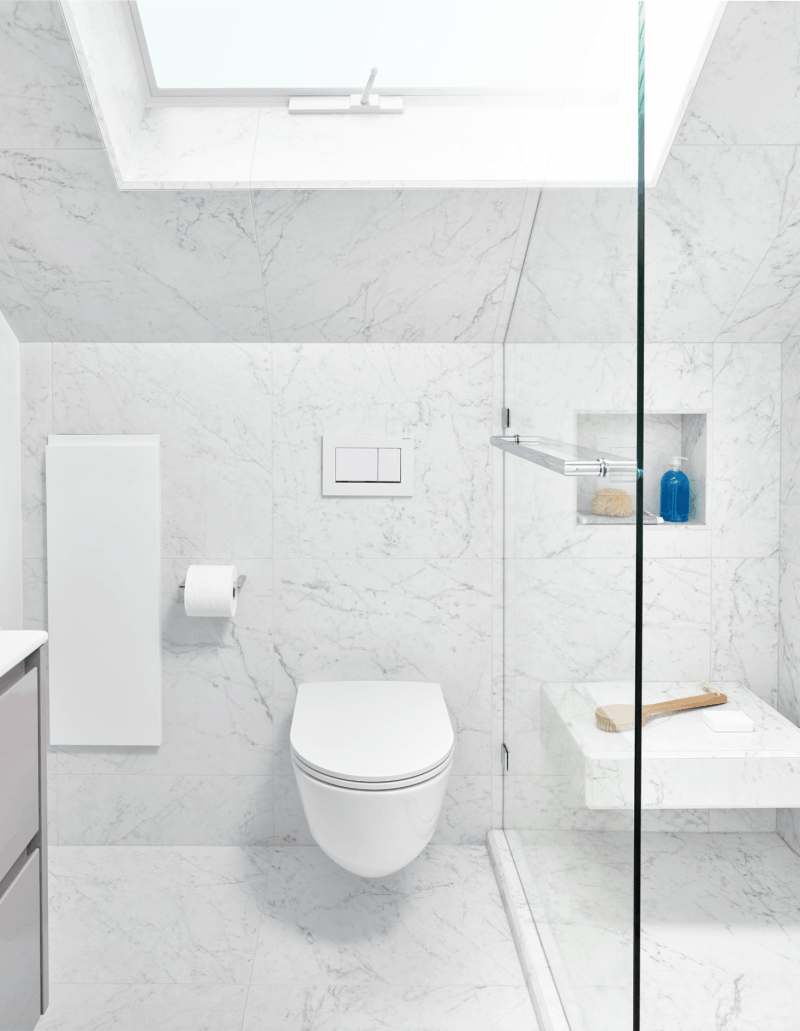
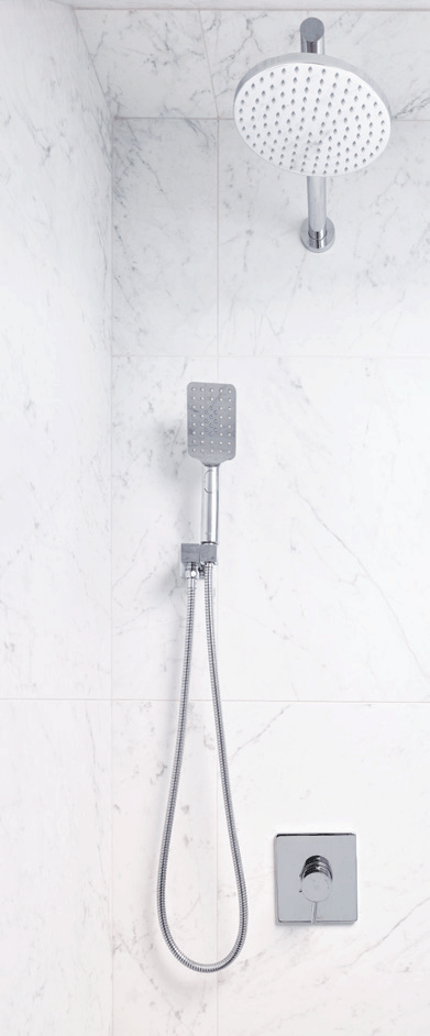
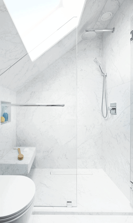
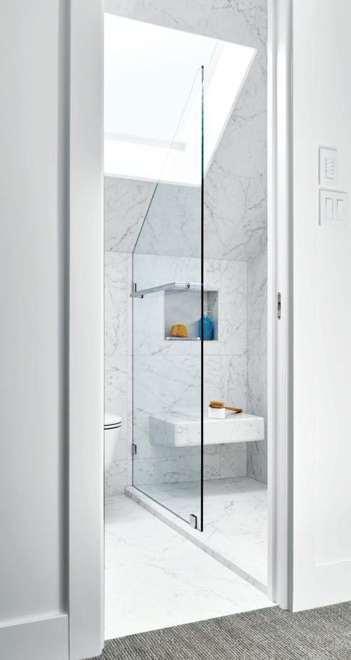
TOULA FAVREAU The top floor of this Craftsman bungalow had two bedrooms but no bathroom. A narrow walk-in closet in one of the bedrooms was sacrificed to create a new attic bathroom. Architectural challenges such as a sloped ceiling and a tiny footprint (5’ x 7’) dictated the room’s layout but didn’t prevent us from filling the space with many wonderful features. A new skylight now floods the tiny room with natural light and in-floor heating makes padding around barefoot a pleasure. Creating the illusion of a much bigger bathroom was top of mind. To achieve this, the vanity, toilet, and shower bench were wall-mounted and the floor tile continues into the shower for a seamless look. Even the linear drain is topped with the same material making it virtually invisible. A custom glass shower wall and space saving pocket door were also used and optimal storage was achieved without sacrificing valuable floor space. People can’t believe this luxurious bathroom is only 35 square feet!
CHT CAN YOU TALK ABOUT WHAT INSPIRED THE OVERALL DESIGN?
TF The homeowner requested a fresh, contemporary look with clean lines. Once the crisp white tile was selected, everything else fell into place.
CHT WHAT IS YOUR FAVORITE DESIGN ELEMENT IN THIS ATTIC BATHROOM?
TF That’s a tough question. I like so many aspects of this bathroom. The sloped ceiling’s proximity to the showerhead made it necessary to tile it in order to prevent water damage. I am really happy with the way it turned out.
CHT WHAT IS A COMMON MISTAKE PEOPLE MAKE WHEN DESIGNING A SMALL ATTIC BATHROOM?
TF A common mistake is underestimating how much storage is needed. Reduce clutter by creating as much hidden storage as possible. Use the space behind walls by recessing a medicine chest and wall cabinets. Make the most of vanities, towel racks, and shampoo niches. Also, avoid high-color contrasts in small spaces. Low-contrasting colors, along with clutter-free surfaces, will always make a room look bigger.
Space Designed by Toula Favreau, www.acanthusinteriors.ca; Photography by Martin Knowles Photo/Media, www.mkphotomedia.com
Latest posts by Canadian Home Trends (see all)
- 2026 Design Trends: The Evolution of Home Design - March 26, 2026
- Expert Bathroom Design Secrets from Canada’s Best - March 26, 2026
- Treasure Hunting: Discovering Unique, Locally Made & Vintage Home Décor - March 26, 2026






It looks so good!! What a great project! Love all the white in your bathroom!