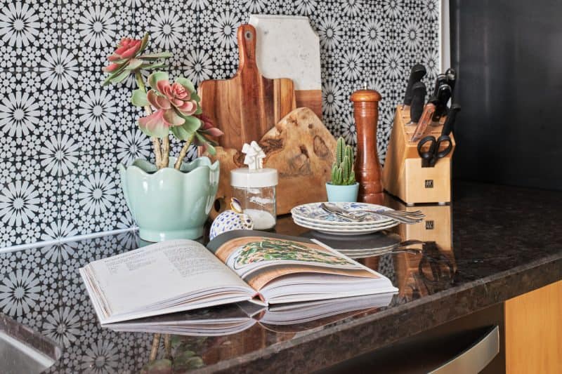
Whether you’re renovating at home or updating your cottage kitchen, get inspired with this cottage friendly look by Home Trends’ Style Editor Jo Alcorn.
Cottage Kitchen: Fun Backsplash
This funky glass pattern backsplash is perfect for a low maintenance space as there is no grout needed for installing, making them easier to clean. The glass retro backsplash is a true wow factor that draws your eye in, creating more depth in a small space.
Pretty Potted Plants
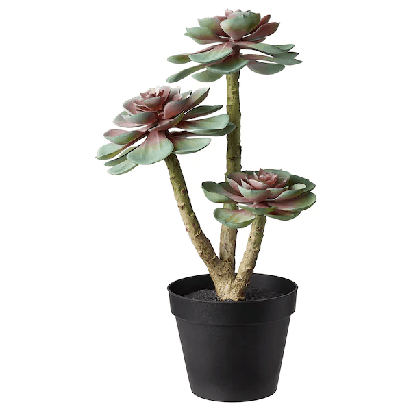
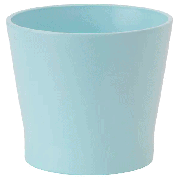
Pretty pastel pots and low-maintenance plants add color and life to a cottage kitchen space without a lot of extra work!
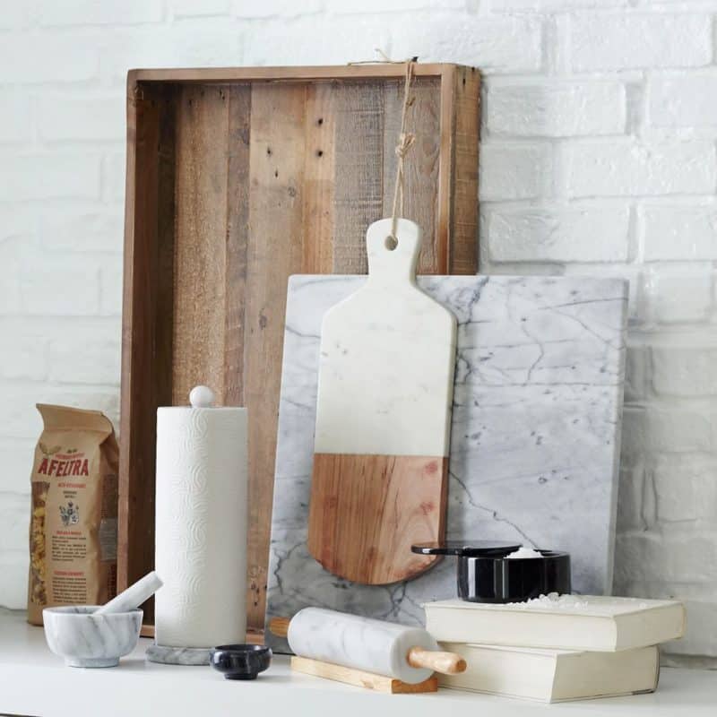
Adding Layers to Your Cottage Kitchen
Layering your cutting boards and serving trays creates a decorative touch while also keeping them close at hand when needed.

COLLECTIBLE TOUCHES
This collectible porcelain rabbit adds a touch of woodland whimsy and is sure to become a heirloom piece!
(As Seen In: 2020 Cottages Special Edition)
LEARN MORE
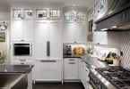
Small spaces are always a design challenge, especially in a cottage kitchen, and the goal is to make even the smallest space look lofty and open. In my recent tiny footprint kitchen refresh, I was tasked with creating a functional, efficient kitchen for a busy family who loves to cook and entertain, without sacrificing style.
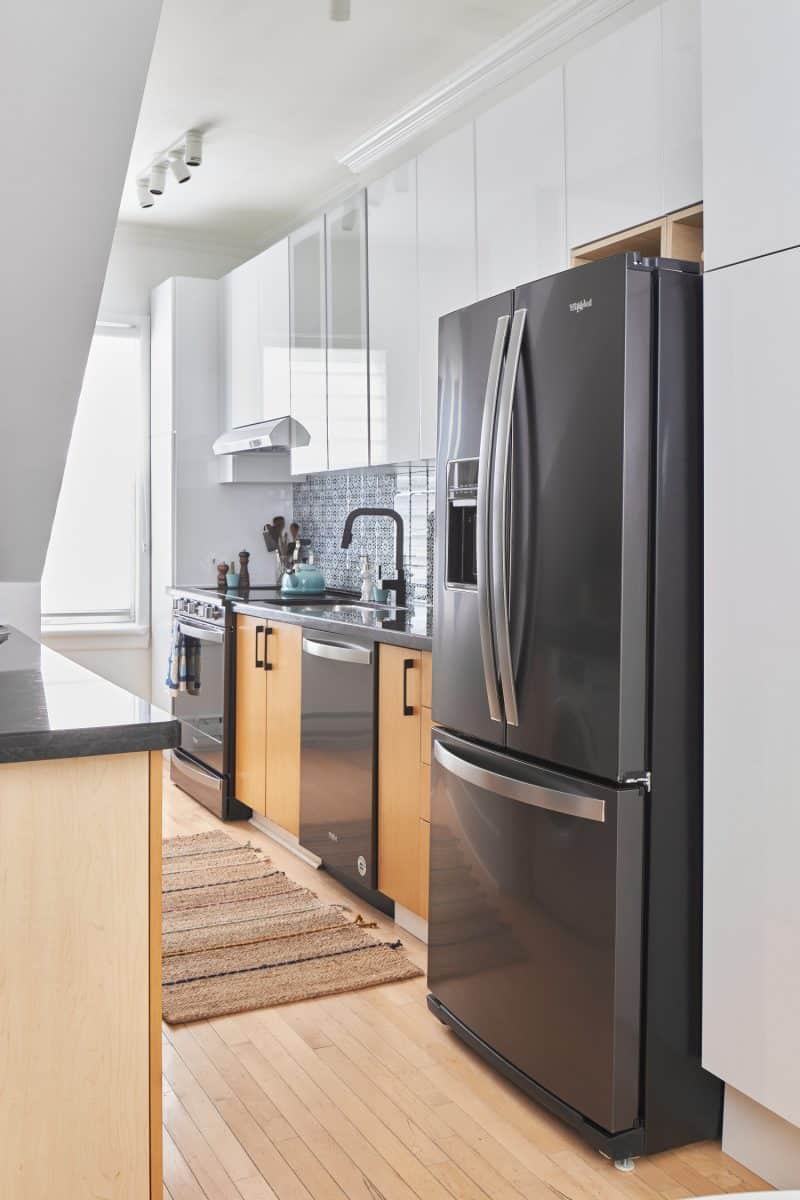
Countertops – The space already had relatively newer countertops that they wanted to salvage and reuse; when this is possible, it’s a massive savings! The existing countertops were black with flecks of greys, browns, taupes, and served as our starting point in the design process.
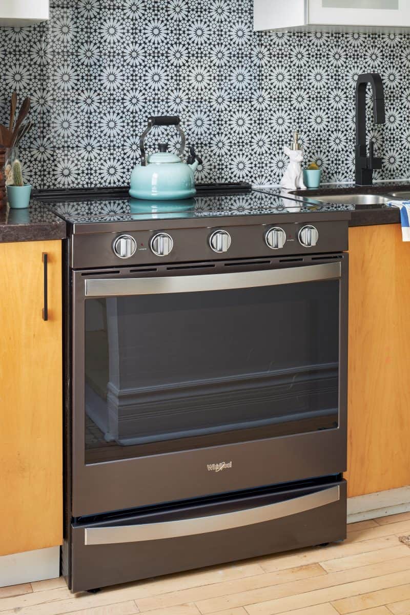
The ENGINE of the Kitchen – Once you’ve found the starting point for the project, in this case, the color of the countertops, it’s time to get to work. The appliances are the main engine of any kitchen so choosing the right style, color and functionality is key. For this space, I needed to play off the black countertops so this naturally led me to a Whirlpool black stainless-steel suite. Knowing how important cooking is for this family, I wanted to give them appliances that had practical technology but didn’t compromise on design. Historically, stainless steel got a bad rep given it was challenging to keep clean so it wasn’t something I’d recommend for clients with children, but the fingerprint resistant finishes hide fingerprints and smudges, and easily wipes clean, which is key for busy young families.
Chilling and Grilling – I love the cool features that Whirlpool appliances now offer to help ease regular household chores and duties. This new smart slide-in electric range has a ‘control from anywhere’ feature that allows you to multitask with the Whirlpool App. Busy bathing the kids but need to preheat the oven or slow down cooking? Start it remotely or adjust the temperature with the keep warm technology from anywhere with a smart phone or tablet so its ready when you are. With it’s stunning front control touchscreen, your range learns, adapts and suggests customized presets that fits your family’s needs. In a small space I love to introduce a refrigerator with French doors. The dual opening, side by side doors allow you to open the fridge without blocking the entire space. And this French Door Refrigerator’s features are amazing – everything from tuck away shelving, spill proof shelves, and adjustable door bins. All these features make life for a family easier.
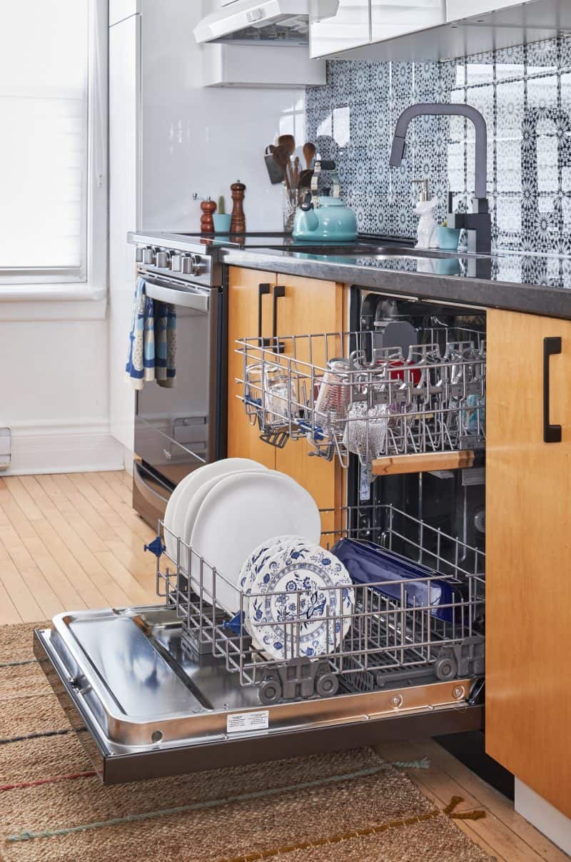
Clean-up Crew – With a growing family, a full-size dishwasher is non-negotiable. My clients had an apartment-sized dishwasher before this refresh. While the inclusion of a full-sized dishwasher did mean giving up some cabinet space, it was well worth it, especially for the one-hour wash cycle. And we were able to compensate for lost storage space with taller upper cabinets and the addition of a pantry next to the fridge, addressing one of the family’s biggest concerns – not enough storage space!
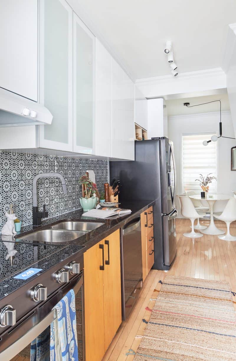
Cabinets Cost – A big cost in a cottage kitchen renovation is cabinets. In this case, some of the cabinets were in good shape so we decided to keep the lower cabinets as they were to create a trendy wood color palette for a two-toned kitchen look. All we had to do was update them with new hardware. While we kept the lowers, we opted for replacing the upper cabinets. The uppers were replaced with a hardware free, glossy white, flat front style. The gloss on these allows the light to bounce off them creating the illusion of a larger space. Choosing to go without hardware kept the lines clean and simple, allowing the eye to travel over them.
Color Continuity – A little paint can go a long way to transform a room and is very cost efficient. This house is open concept, so we had to paint the entire main floor for a better visual flow. It was a pretty extensive paint job, including the kitchen, dining room and the entire first floor! A new coat of paint helped the entire space to have a fresh, clean look. Especially since we brought in white stark gloss cabinets, we wanted the walls to simply blend in.
A Splash of Color – Another key to a sophisticated home or cottage kitchen and an element that can make a huge design impact is tile. For this space I went with a funky glass pattern backsplash from The Good Tile. My clients love to cook so these tiles were perfect as there is no grout needed for installing, making them easier to clean. The glass retro backsplash is a true wow factor that draws your eye in creating more depth in this small space with another reflective material for more light to bounce off.
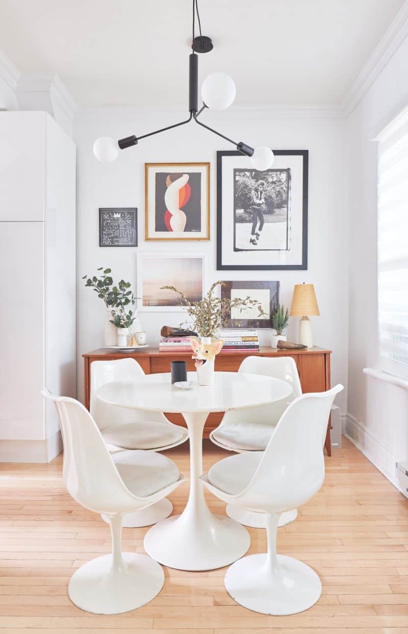
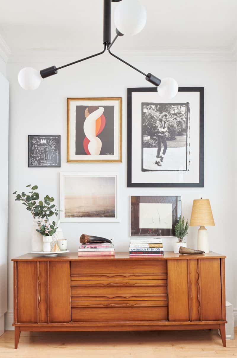
Let’s Eat – In the dining space, we created a gorgeous picture wall with some of the clients’ favorite pieces of art. An antique sideboard was a perfect compliment to the clients’ retro style and an ideal for additional storage so the table can be kept clean and open. The color of their existing table and chairs was a perfect tie in with the upper cabinets for continuity.
The Finishing – The final touches in this kitchen that tied everything together were the cabinet handles, lighting and the faucet. The cabinets had outdated handles and I found replacement handles in black that took the cabinets to a whole new level of sophistication. The lighting was replaced and went from functional to an integral part of the beauty that faded into the space rather than made a distraction. And the faucet is stunning! This sleek black Delta faucet has every feature you can image from a pull-down nozzle to spray options, but it’s the design that makes it a showstopper.
When we started this kitchen, we were looking to do an appliance upgrade and a facelift, but the end result was way more than the family could imagine. In small city dwellings or in cottage kitchens when you can’t change the footprint of a space, some clever attention to detail can make even the smallest space feel grand.
Latest posts by Jo Alcorn (see all)
- Kitchen Trends with Jo Alcorn - April 5, 2026
- Trendy Culinary Haven - April 5, 2026
- Modern Country - April 5, 2026






Love the look. Where can I source the light fixture in this dining room vignette? Also would it work well for standard 8 foot ceiling heights?