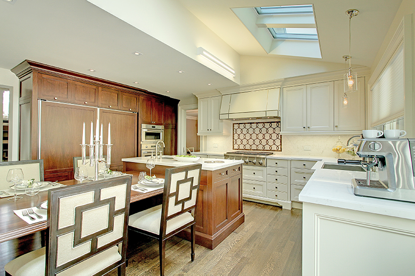
In any good kitchen design, one of the primary principles to consider is zone planning. Having designed kitchens for years using this principle, I allocate the proper space and equipment to all these areas. As times are always changing, I feel it’s not only important to consider these zones but to make sure that I also consider the lifestyle of the person using the kitchen. The typical zones are – storage for non-consumables, storage for consumables, a food preparation zone, a cooking zone and a cleaning zone. However you must also consider other secondary personalized areas such as a work zone or a place to do homework, a separate baking zone or simply an area where friends join in and can be a part of the cooking experience.
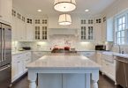
With “ramsin’s reno” one of the most important elements was to make the kitchen low maintenance. The selection of materials was to be beautiful but not overly delicate and had to function well in an area of the house that typically has the highest volume of traffic. For the counter top I chose to use Quartz. In the TORQUAY Colour I wanted the beauty of natural stone with the quality and features of quartz. I used this material on the backsplash with an intricate inlay pattern to provide a focal point as well as a seamless and easy to clean surround. The Island, being the food preparation area and the busiest, is done in a stained Walnut. Stained finishes are more forgiving and easier to touchup than solid coloured lacquer finishes. The floor
is Quarter sawn Oak strip flooring and is sanded and finished on site offering a seamless finish that looks rich and is resilient to spills.
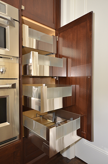
As always, I often place a great deal of focus on the food preparation zone. I believe in a dedicated food prep sink so the mess of preparation and the transfer of contamination is kept manageable. There is a stainless steel recycling bin inserted into the island counter top for food waste surrounded by a large Walnut butcher block that offers easy access for transfer of waste. This bin can double as an ice bucket at other times. As with any of these spaces, I tried to define any functional element that bothered me and then came up with solutions to eliminate those problems. For example, while preparing food, I “hate” having to open the garbage drawer with dirty hands. So, I included the BLUM “servo-drive” system on this one drawer. With a slight touch of your knee, it electronically opens the door and then with a slight push, it closes. The rest of the hardware consists of full extension drawers that function smoothly and effortlessly, making any kitchen a joy to use.
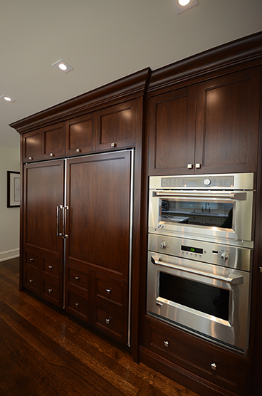
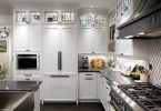
A common complaint I find with clients is that there just simply is not enough space in a fridge. I designed the “consumable storage” for a full size fridge and a separate full size freezer by GE monogram. Because of its grand scale it allows for lots of cold storage without having to have a secondary freezer in the basement. I paneled them with the look of doors and drawers to have them blend nicely into the adjacent wall of cabinetry which also houses a double oven as well as plenty of pantry space for dried consumables. The upper cabinetry is often a great space for non consumables, especially light items. Lighting the underside of these cabinets effectively is often underestimated. Puck lighting is regularly used and not necessarily ideal task lighting. I chose to create light pads covering the entire underside of the cabinet, producing an even and useful light source. All lighting should be a major consideration in such an important space. It’s important to use multiple sources of light with individual controls to offer practicality and flexibility. Some of these may including pot lighting, wall washers, pendants, accent lights and, if possible, lots of natural light.
As for an eating area and its furniture, I chose a custom solid Walnut table top, with decorative turned legs, attached to the back side of the island. I did this in consideration of traffic flow as it enabled more access and allowed for more seating. Using a floating table with chairs would require access all around and ultimately take up more space and hinder the flow.
I often say – “A pretty kitchen is much like a pretty girlfriend or boyfriend. The looks are not enough if what’s inside is bad” – any good design involves a great deal of planning for function as well as esthetics. – Text by Ramsin Khachi
Marana Kitchens
www.maranakitchens.com/main.html
Blum (Kitchen Solutions)
www.blum.com/ca/en/index.php
Cambria (Quartz Counter Top)
www.cambriausa.com
Blanco (Recycling Center)
www.blancocanada.com
Velux (Skylights)
www.velux.ca
Zaneen Lighting
www.zaneen.com
Khachi Design Group (Custom Hood Fan)
www.khachi.com/design-group/khachi-design-group
New Ravenna (Custom Back Splash)
www.monogram.com
GE Monogram (Appliances)
www.newravenna.com
Latest posts by Canadian Home Trends (see all)
- 2026 Design Trends: The Evolution of Home Design - April 20, 2026
- Expert Bathroom Design Secrets from Canada’s Best - April 20, 2026
- Treasure Hunting: Discovering Unique, Locally Made & Vintage Home Décor - April 20, 2026

