Kitchen Renovation – In this large kitchen, my clients had already done a face lift about 7 years ago (painting cabinets and changing up a few things) but now it was time to call in the big guns. They wanted a complete gut and re-do to create their ultimate dream kitchen. Not only did they want to demo the entire space, they gave me cart-blanche on the entire design! I was beyond excited when I received that news.
Flooring
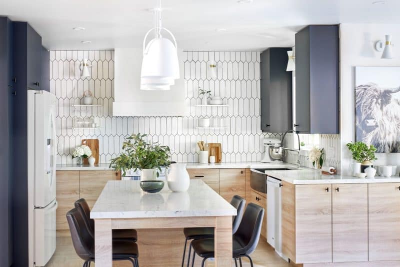
The only item the homeowners were keeping in this kitchen renovation was the flooring, which was just replaced a few years ago. That made it my jumping-off point for the color scheme and design of the space. Sometimes the direction on the design concept is already handed to you, in this case, the flooring, so it is up to the designer to make it all come together.
Cabinets
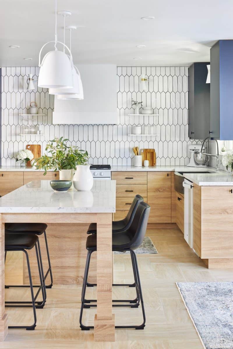
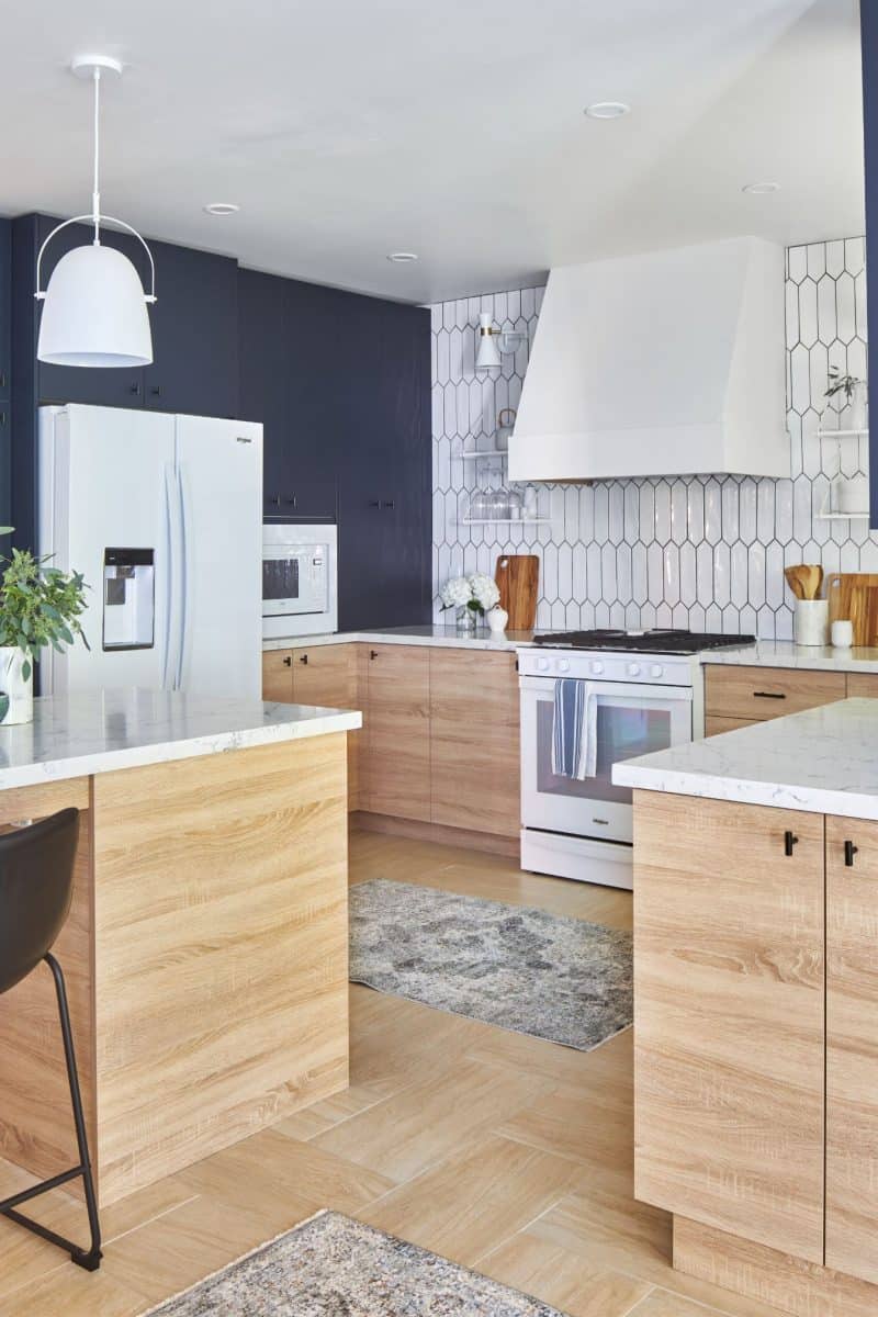
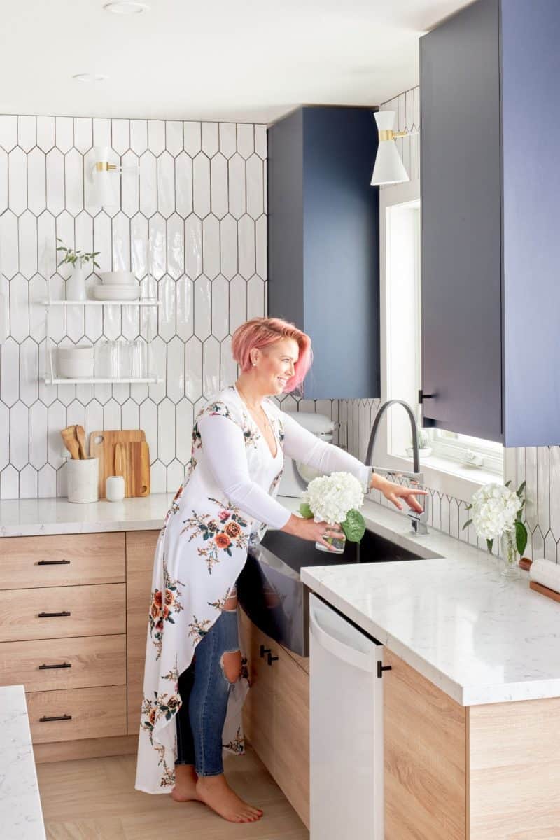
We started with switching up the entire layout of the kitchen and cabinets. I paired up with a family-run cabinet company, Pulsar Design, which specializes in beautiful, functional spaces. They were able to make my two-toned concept come to life remarkably. They provide 3D realistic renderings for all of their designs so it helps the designer and homeowner truly visualize what the kitchen will look like. I went with a sturdy ¾” wood-grain lower to tie in the floor color, while the uppers were created in a dark, solid blue to create a dramatic contrast for this kitchen renovation. I went with a flat-panel upper for this project with the uppers extending right up to the ceiling to create the look of grandeur; functionally, this adds more storage space to the kitchen too as we were able to remove the bulkhead and add more cabinets. Delightful details from this company included the softest closing doors and corner doors that open wide so you can access hidden nooks, all of which impress the homeowners.
Appliances
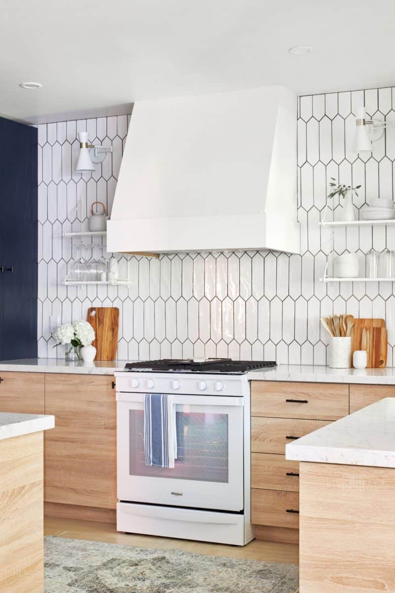
After the cabinet design was in place, I moved on to the appliance selection. And guess what? White appliances are back! You heard me right. Whirlpool Canada has sleek and modern white appliances that complete the overall look of the kitchen. First, I chose the Smart Front Control Gas Range, which might be the smartest range I have ever seen and used, as this appliance allows you to send cooking instructions from your phone directly to the range. You get instant access to the settings that you use the most, with a touchscreen that learns, adapts, and suggests customized presets based on your family’s routine.
Next, I selected the Counter Depth French Door Refrigerator with a pantry inspired layout and infinity slide shelf, that helps make room for those taller items. Finally, we added the Stainless Steel Tub Dishwasher with a third level rack that allows you to load more dishes than a traditional 2 rack system, and provides extra room for those hard to fit items. These appliances truly complete the space and will give any home chef an advantage at their next dinner party.

Countertops
Next up were the countertops. For this kitchen renovation, I couldn’t resist the White Attica by Caesarstone that is primarily white but has a marble ribbing through it that matches the uppers perfectly. It’s elements like this that help brings the entire space together. This is Caesarstone quartz, non-porous material that never needs sealing. The great thing about quartz it is super low maintenance yet stunning, making it perfect for a busy family with kids, who also like to entertain.
When going with a material like quartz you want to ensure that you have it professional installed. This is not a time to try your hand at a DIY, leave it to the professionals. For this installation we worked with Stone Edge Marble and Granite to manufacture and install the counters that they fit perfectly.
Contractors
I am a true advocate for hiring the right contractors and trades for each project and step along the way no matter what. As reno’s can be a huge investment and you want to make sure they are done right and bringing you a proper return on investment. That is why I turned to Harrington Homes as my GC to make sure the kitchen reno ran correctly and was done to perfection.
Colors
To brighten up this space we chose the color Dove Tail from Benjamin Moore. We painted all the walls, trim, and even the ceiling in the same finish to create a brighter space that is simply stunning.
Plumbing
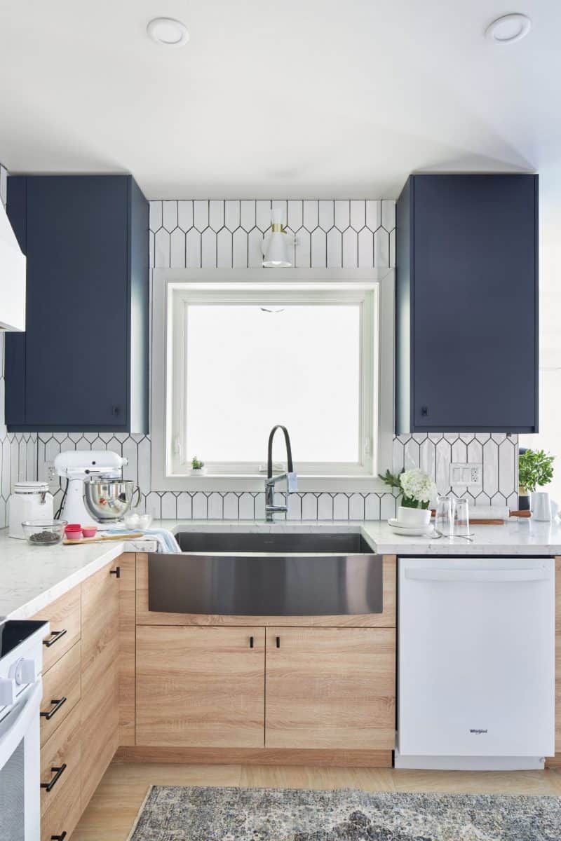
Let’s talk about a feature in the kitchen that might not always be the center of attention – the sink. That all changed with this kitchen renovation design. I chose an edgy farm sink from Wayfair Canada that really takes center stage. What people might not know is that Wayfair Canada has thousands of affordable renovation must-haves that can be delivered right to your door.
Another sexy element I brought into this kitchen was this sleek black faucet from Delta. It’s the Pivotal Single Handle Exposed Hose Faucet that includes a powerful magnet to snap your faucet spray want into place and hold it there. It’s truly a gem in this gorgeous space.
Backsplash
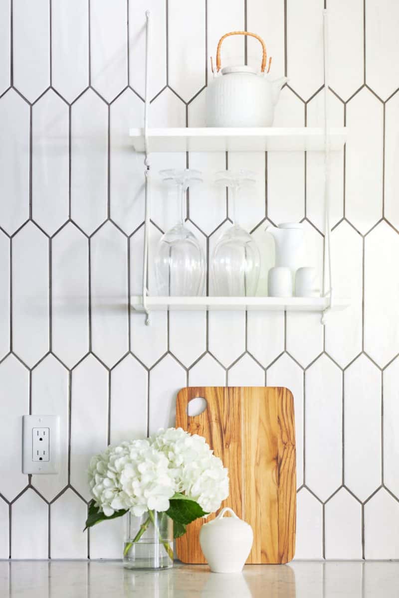
In this space, I opted to do NO cupboards on the back wall so I could do the entire wall – counter to ceiling in this gorgeous wall tile from M2 Tile & Stone. The tiles for this kitchen renovation are sourced carefully from premium European suppliers and kept in stock locally. I chose this pattern Crayons Bright White 3” x 12” with a slightly darker colored grout to really make it pop. I also opted to have the tiles laid vertically to truly show up the tile details and elongate the wall.
Lighting
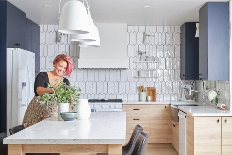
To make the tiled wall really stand out, I added some gorgeous sconces from Wayfair. White with a touch of gold was the exact tone I was going for. I also hung three dome pendant lights over the island to help add zones space and add functional lighting to the island, which of course is on a dimmer for those intimate gatherings in the kitchen.
Countertop appliances always need to be factored into a kitchen renovation because, along with full size appliances, they are some of the most used items in a kitchen and they are typically on display all the time.
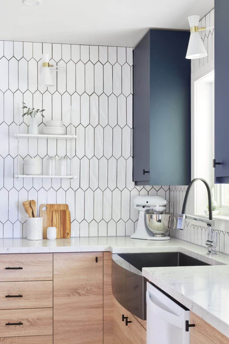
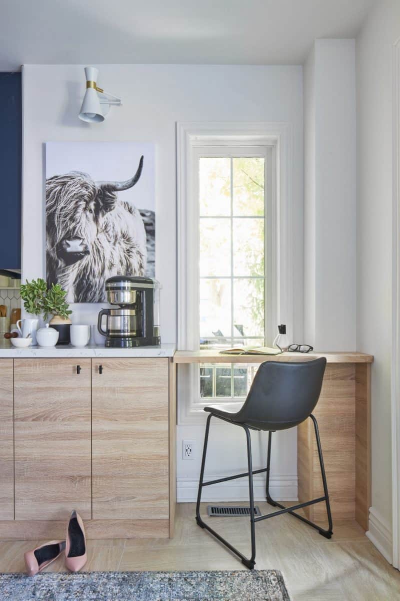
For this family that loves to cook and bake, I chose KitchenAid. Their appliances have smart features that enhance the home cook’s experience like a stands mixer that helps you make everything from fresh pasta to burgers to veggie noddle’s and ice cream. A coffee bar was a must for this family as well. I chose a 12 cup drip coffee maker with a programmable warming plate.
Staging
Now for the stunning finishing touches. We shopped at Bed Bath and Beyond Canada to find the perfect accessories to tie this kitchen renovation together. What I love about shopping with them for a kitchen makeover is you can find everything you need in a one-stop-shop based on what you are comfortable with including in-store, online or curbside pickup. We chose low back black stools that are super comfy and tuck tightly into the island to give more space surrounding it. Perfect throw pillows, cutting boards, cute sugar bowls, and teapots complete the look on the open shelving. They have such an extensive collection of affordable options and offer free shipping which makes it a great place to grab all the finishing touches.
Latest posts by Jo Alcorn (see all)
- Kitchen Trends with Jo Alcorn - April 3, 2026
- Trendy Culinary Haven - April 3, 2026
- Modern Country - April 3, 2026

