Many have wondered how the Color of the Year is determined. This is where it gets complicated. People think the annual Colors of the Year (selected by the assorted paint companies) are decided by committees sitting in their ivory tower discussing what the consumer just must be attracted to the following year. That couldn’t be farther from what actually happens.
Color trends are created by global and local events, including politics, the environment, even housing affordability. Color and design professionals from many industries all over the world, observe what is happening in their region. They then select key stories to share, and discover what common themes are occurring within each region (North America, Latin America, Europe, Asia Pacific). These stories reveal specific needs that will arise. For example, the warming up of the colors, in part, comes from needing to contrast the cool blue light of our devices that we are so connected to. Much of this work is done with the Colour Marketing Group® , a not-for-profit, international association of color design professionals, essentially a forum for the exchange of all things color. Members represent a broad spectrum of designers, marketers, color scientists, consultants, educators, and artists. All of the insights and research is then narrowed into three key stories.
In 2018, experts knew how the Color of the Year was determined by these three key stories:
Self-Truth – The lines are blurred between an artificial world and humanity. Raising the question, how much truth is there in what we project in our “insta-worthy” world, what is real vs. what is manipulated or distorted, what path do we take?
Our self-truth would become top of mind as we want to know more about where we come from, our ancestry and the indigenous people and stories around us. This was predicted to show up in 2020 to evoke images of reddish brown indicative of pottery and abodes. There would also be yellow tones and warm creams, representing a light to illuminate are chosen.
Em-PATH-y – Our connectivity to our devices has given us a voice but not on a level filled with meaning or human connection. We feel alone and isolated bringing our struggles with mental health to the forefront.
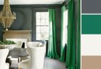
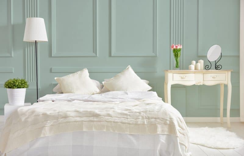
The need for human connection will make us want to connect on a deeper level for us to feel heard, seen and valued, as well as for us to hear, see, and value others. This leads to more compassion and empathy for humanity in general – embracing our imperfections together. It was predicted that this need in North America and beyond would manifest in Navy blues and warm pink hues. You see both of these predictions come to life in the Benjamin Moore and Sherwin Williams Colors of the Year for 2020.
Sherwin William – Naval 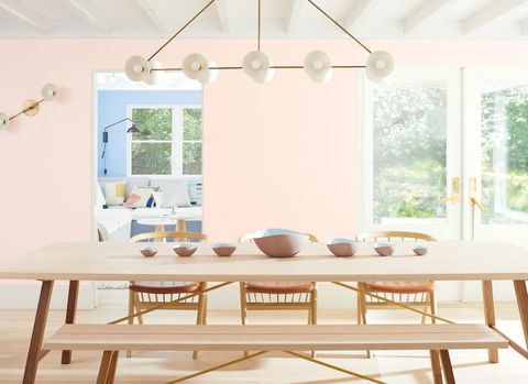
Benjamin Moore – First Light
Do Tank – Moving forward from the old prototype of a think tank, we are done standing in the shadows hoping something will change.
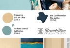
As a society, we are no longer sitting and discussing what should happen, or speculating blame. It is time to act and people are. From changing their diet to vegan (in order to help the environment), or taking less Trans-Atlantic flights, people are looking to what they can do each and every day to create change. Millennials are pressuring politicians to live the talk. Consumers are demanding that companies walk the talk and they are voting with their wallets. The colors that this would propel into our spaces and wardrobes will be indicative of nature. This would include a greenish gold (which I believe we will begin to see more next year) and organic green tones both a dusty light, as well as a moody greenish blues and midnight green tones. We see this manifest in C2 Color of the year Salty Brine.
So now that you know what was predicted in 2018, what colors and styles do I think will be popular in 2020?
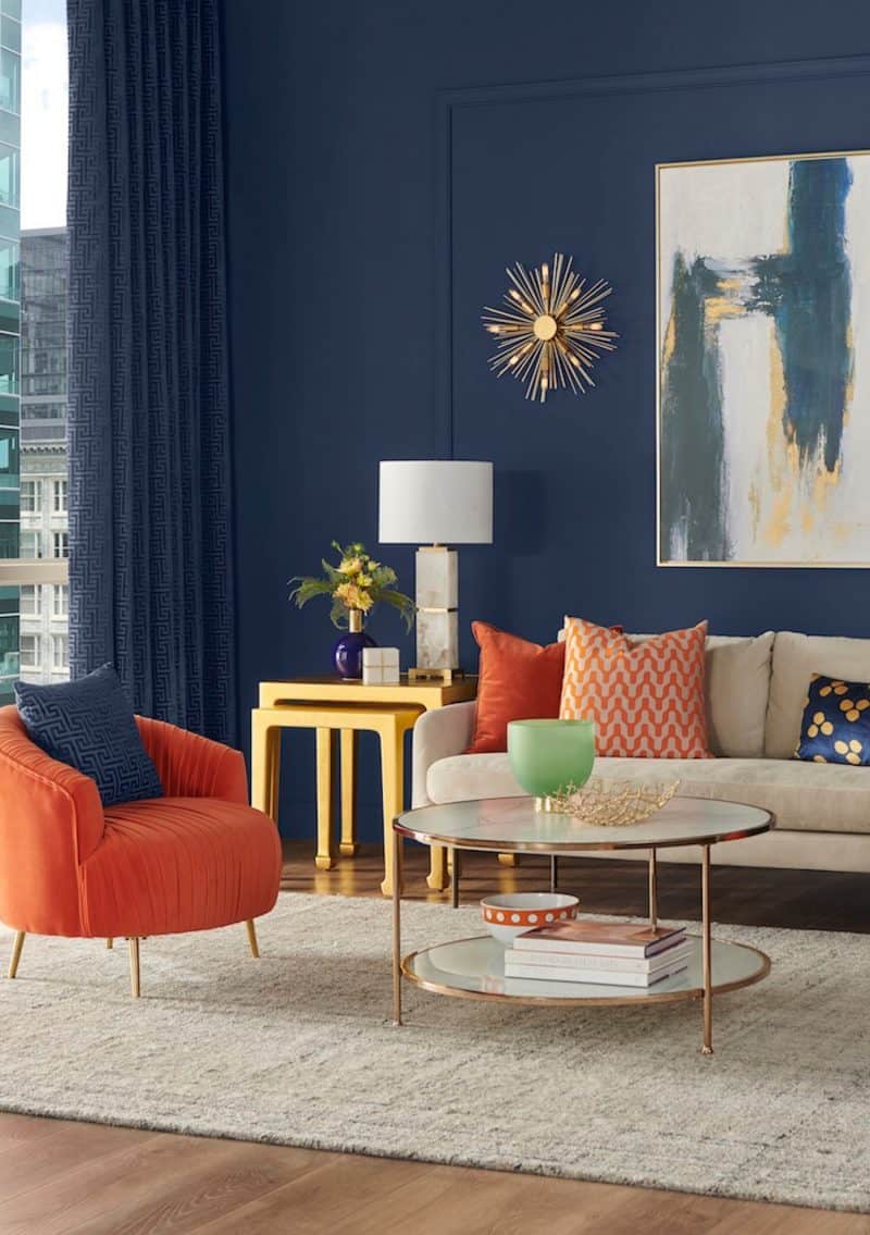
Color has always had an impact in design, and in 2020, there will be a very strong representation of Greens, golds and Blues. Most of which will have, even a slight, green undertone. As we color experts know, it is all about the undertones!
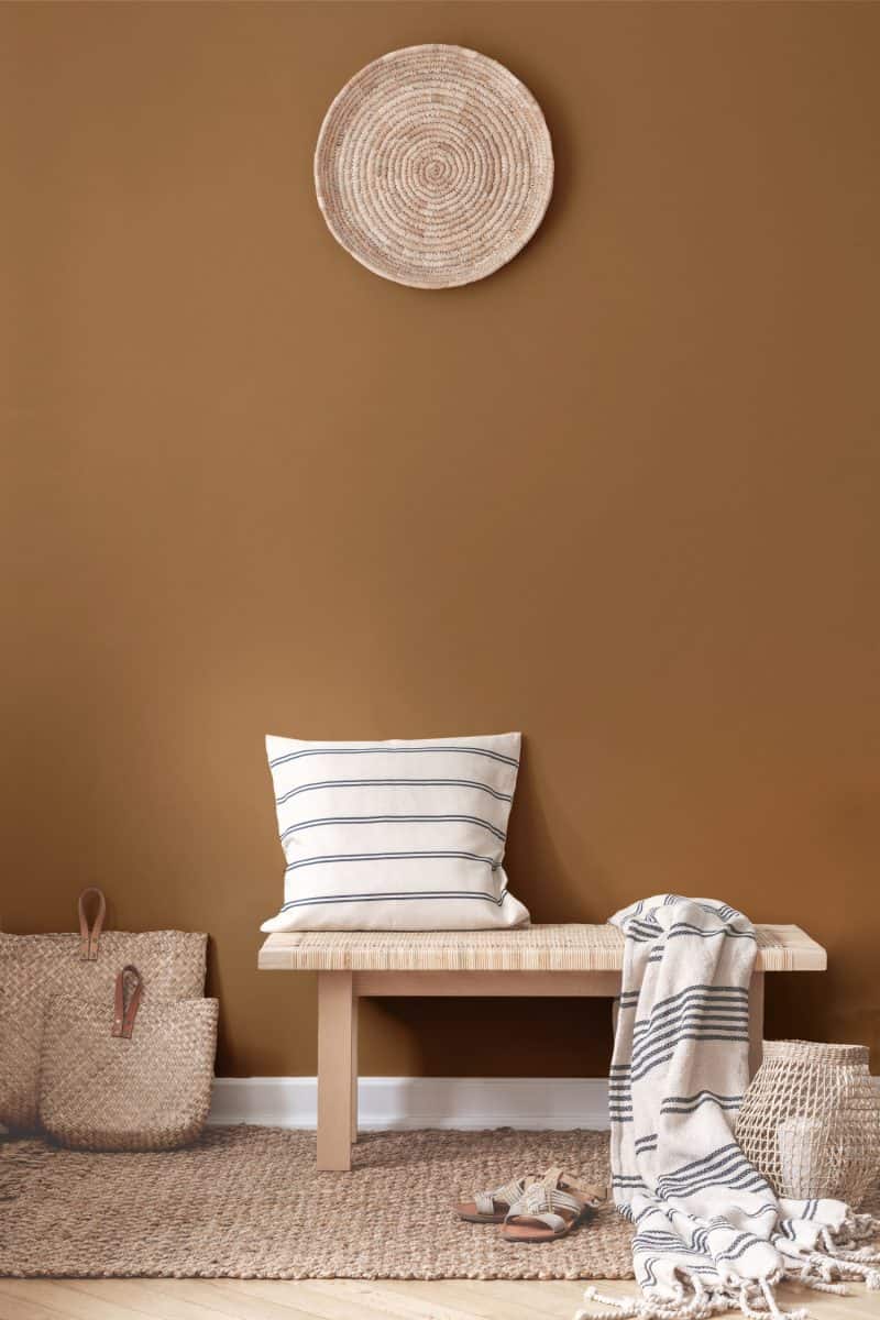
We will also be seeing a lot Green based golds, as a complex chameleon color that changes depending on the neighboring hues – appearing more gold or more green in different palettes. As in Benjamin Moore’s CSP-920 Golden Thread or C2 Paint C2-650 Plantain.
This color will be complemented by shades of black, and not just any black, you guessed it, a midnight green as in Benjamin Moore’s 2136-10 Black Knight and C2-677 Black Pearl. Black has been on the scene all through 2019 but it is making a slight shift.
Colors are warming up, adopting the influence of the gold. The whites will take on a warmth, more of a cream vs the bright whites of recent years.
Deep soft edged blue-green, again, influenced by yellow crosses cultures globally and creates a gender neutral connection.
Neutrals will continue to play a strong supporting role to the more saturated colors that we will be seeing. The neutrals are warming up, here again the yellows are the influencers turning the grays of the past decade into warmer tones. These will provide a neutral listening environment. Pastels will be considered part of a neutral palette, including soft dusty pinks and warmer blues with a green undertone.
Essentially earthy tones are on their way back, including the reddish brown tones of the earth, indicative of stories and ancient traditions. They will still take some time to filter through into our homes, but we are definitely seeing this coming into our closets and decor touches.
As you can see, it’s a big process experts go through, and now you have an insight into how the Color of the Year is determined.
For more inspiring ideas, click here.
For more unique items for your home, click shopCHT.com.
Latest posts by Thoma Doehring (see all)
- Choosing The Best Exterior Paint Colors - June 26, 2026
- How is the Color of the Year Determined? - June 26, 2026