Striking symmetry is the signature of this custom designed kitchen. Heirloom Cabinetry’s Larry Koop and Barry Penner worked closely with their clients and designer Olenka Antymniuk to achieve a highly efficient workspace with great visual appeal.
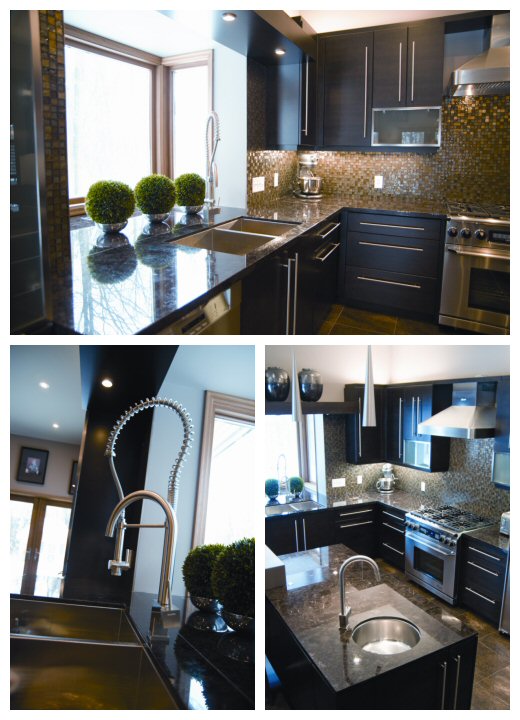
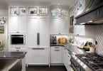
Geometric planes convey a minimalist look. Ample natural light, augmented by generous under- and over-cabinet lighting, is reflected in the gleaming stainless steel accents. The bulkhead over the sink is pushed out, creating a bay window that appears to light up the whole room. Glass tile that complements the stone chosen by the owners, wraps around corners and ties into the window, further brightening the kitchen.
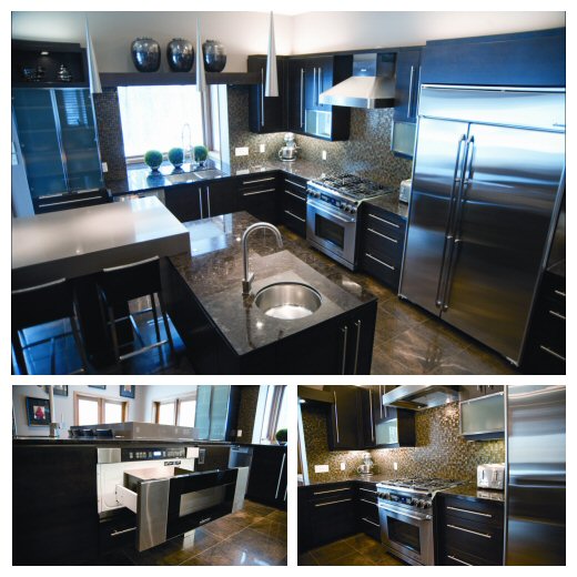
A commercial gas stove and oven and four-foot side-by-side refrigerator/freezer indicate this is a practical workspace. The acid-etched, steel framed glass doors on upper cabinets flanking the stove afford a whimsical break from standard design while offering practical access. The doors swing upward on special hinges that keep them open at a 90° angle. Rich espresso stain on maple kitchen cabinetry and the warm tones of the tile floor work well with the steel.
True to symmetrical goals, the stove is centered between 28” cabinets. Ordinary kitchens often have one 24” and one 26” unit next to the stove. All the hardware lines up, following the flow of the workspace. There is an abundance of lower cabinets, featuring “Blumotion” tandem stainless steel self-closing hardware.
Lift and roll out inserts enhance the pantry. “In the kitchen world, there are so many things to make it practical and user friendly. My partner and I work with the clients to achieve a kitchen that suits their personal needs and tastes,” Larry explains.
Dark charcoal stain on the pantry unit, instead of the kitchen’s espresso, hints at other surprises. One might expect a high definition television; rather, the focal point is a fireplace. It suggests warmth and enjoyment for those gathered at the table.
On the left of the table two pedestals – a bank of supporting drawers, provide convenient storage for things like cutlery and napkins. The right leg of the table is the same width as the tabletop. From the patio doors, one sees a flow of granite from the floor upward and across the tabletop, which is large enough to provide seating on both sides.
The ceiling in the eating area is higher than the rest of the kitchen and cabinetry above the pantry extends beyond the lower section. The columns and bulkheads were fabricated to add to the sense of flow.
The working island ensures meals can easily be passed to the table. The island has a bar sink and to the right of the sink, an under the island convection/microwave oven. The wine cooler under the island counter is convenient to both the granite table and the formal dining area.
Functional components and geometric artistry comprise a practical and enjoyable kitchen. Larry concludes, “When you look at this kitchen, you are not seeing pieces; you get the whole picture.”
For more information visit Heirloom Cabinetry Ltd.
Text By Pat Gerbrandt
Photography by Fred Elcheshen

Latest posts by Canadian Home Trends (see all)
- 2026 Design Trends: The Evolution of Home Design - March 19, 2026
- Expert Bathroom Design Secrets from Canada’s Best - March 19, 2026
- Treasure Hunting: Discovering Unique, Locally Made & Vintage Home Décor - March 19, 2026


Great Kitchen! Would love to live there one day!
I would like to know where I can purchase the fireplace in the Symmetry Suits article.
It would be helpful to have product sources listed in the back of the magazine like they do in others.
Great magazine.
Thank you,
Debbie Moncion
Hello Debbie,
Thank you for your comment. The Symmetry Suits article featured a kitchen done by Heirloom Cabinetry – http://www.heirloomcabinetry.ca. They will be able to assist you with finding the suppliers for any of the features including the fireplace.
this kitchen is STUNNING! I wanted dark cabinets in mine but when i went to order they had sold out and i already had no kitchen for 4 days.
GREAT SITE BTW!
I think I would prefer my kitchen like this with things lined up.