We know that colours can make you feel anything from tranquil to rage. When I worked at the paint store I would hear very strong statements about colour. “Oooh! What a horrible colour, I hate or I love that colour” from customers. I learned very quickly the tie between emotions and colour. So choosing colours wisely for your home is important.
Most of the time our personal reaction to colour is based on childhood experiences.
Colours that made us happy – for me I love orange. We had an orange swing chair in our backyard. When my grandmother would come to visit, she and I would sit on that swing together and chat away the summer. So when I see orange it makes me feel happy, peaceful and safe.
Colours that made us sad – dusty rose pink was the colour of my bedroom when I had pneumonia as a kid and had to stay inside for most of the summer vacation. Who gets pneumonia on summer vacation, I still feel ripped off about that!
Colours that were upsetting – It was called harvest gold when I was a kid and our kitchen was painted and wallpapered in it. Quite stylish at the time, but for me it evokes a memory of grief from childhood as it is the colour I see when I remember my father, head in hands sitting at the table after he had learned the news of a plane crash that a family member was in.
As you can see, colour reactions can be very personal. Colours evoke emotions to events long past some wonderfully positive while some very negative. Fortunately, most colour memories from when we were children are positive and studies show us this continues into adulthood. We get that warm fuzzy feeling every time we are surrounded by our favourite colours.
So you know what that means, paint that room or at least one wall your favourite colour. Keep it secret and you`ll have a little smile every time you see it and no one will know why.
.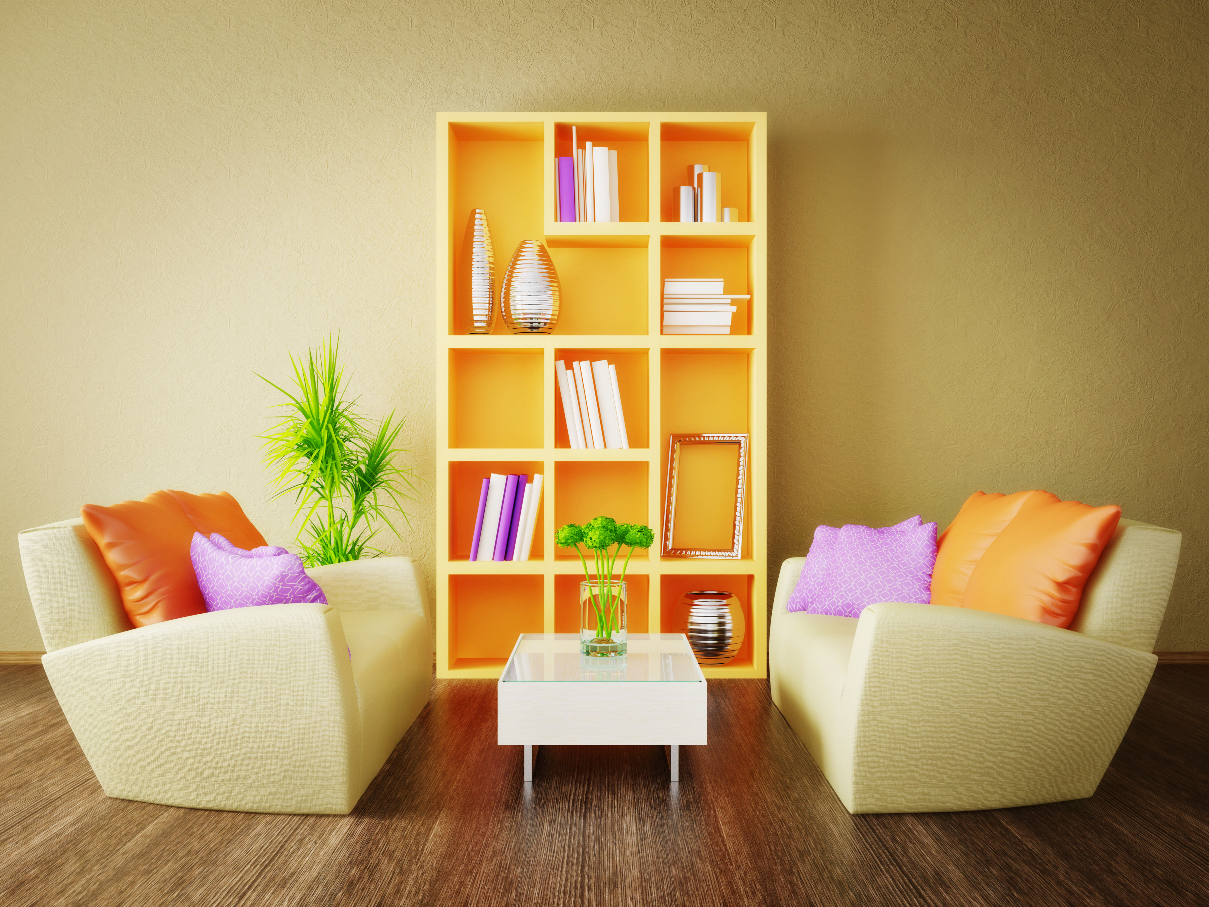
I painted the inside of a bookshelf my swing chair orange. No one knew why until now.
Check out these great oranges in the General Paint
ColorLife© palette. Grab a colour chip at one of the stores for colour accuracy.


Explore your own feelings about colour at http://www.generalpaint.com/stylyze
Good Luck!
Latest posts by Canadian Home Trends (see all)
- 2026 Design Trends: The Evolution of Home Design - July 3, 2026
- Expert Bathroom Design Secrets from Canada’s Best - July 3, 2026
- Treasure Hunting: Discovering Unique, Locally Made & Vintage Home Décor - July 3, 2026


My kids get to pickmost of our colors, depending on the room that we are doing…my only stipulation is no loud colors that will take 8 million coats to cover…….we also had a color consultant come in to help pick colors for our main floor as I could not decide at all
I am not sure if my color preferences come from childhood or not but I can tell you that my favorite colors calm me. I love rusts and earth tones, most of our homes have had a brick/rust color wall in the main living room along with some gold tones or olives in the past. I really like the café colors now too. These colors sooth me, much like the fall which I love and being outdoors in nature. We live in a “borrowed” house right now – as we are missionaries and the colors here are not even close to my earth tones, we have been told we can repaint but money is tight. If we were to win this contest the living room would be painted first, which would make me feel like I was home.
I pick my colours through emotions – ones that make me feel good/happy and fit with my life style.
As a retired museum curator color has always been the key to any exhibits or displays I created and I apply three criteria to my choices of color. Number 1: Have some basic understanding of how the chosen color interacts with other elements in a space. Number 2: Use your personal connection to the color and your understanding of the varying visual, spiritual and emotional impacts colors have on all of us. Number 3: Decide if the chosen color will be the dominant forefront or the subtle backdrop to accent other elements of a the space.
While the above may sound like a formula or rigid and academic, it provides a simple method to approach a change of color in any space. Color is magic and you world can be magically transformed by the colors you choose
Color is the heart of our perception and has a powerful emotional and spiritual influence. Advertisers, artists and designers understand this very well. It’s impact is diverse – what is ugly to one, is amazingly beautiful to another. Color keeps us stimulated, invigorated and it is one of the least expensive ways to transform a space.
I love red, but what red? You love green, but what green? As a child I loved purple, as a teen orange, as a mom blue, as a grandmother I love red and now that my grandaughter loves purple, I have come full circle.
A favorite childhood memory is the story of how the Creator painted a rainbow in the sky as a promise and blessing. So pick up a brush or roller and indulge, let’s paint a brighter happier world by mixing, matching and enjoying color!
I love the cards that show real rooms painted in your chip colours… that is always inspirational, and a great way to choose paint colour.
Royal blue reminds me of a dress my Nana used to wear when I was little. It was a simple summer shift she had made herself and made a dress for my doll also.
If my room is going to have a decorating theme I choose my colors that way. I loved the color of a car one year ( Southwestern sienna)so that is what I painted my living room with it’s African theme. Our bedroom is decorated in Asian so it has earth tones.
I love the color purple – lilacs are my favorite flowers and we’ve always had multiple bushes growing in every house I’ve lived in from my childhood through to being an adult. Now if I could just get my husband on board with having a purple room!
For me, when we first get into a house I pick a general neutral tone for all the rooms to be repainted on a scale of 3 shades of that color. For instance in my dining room is Pewter Moon, the living room is Ashford and my office is Silver Spree which are all just different shades. Then once I’ve lived in the space for 6 months I can start picking new colours to repaint once the rooms have picked up a personality and I’ve seen what the sunshine does during different points of the day. So far it’s worked!
I try to pick colours that make me feel happy throughout the day. I love having a light (buttery) yellow bedroom, and have since I was a teenager b/c it’s such a nice colour to wake up to.
For a long time I was one of those people who had beige walls and wore mostly black clothing. And then I realized, who was I kidding? I wanted to live a life filled with colour. I was attracted to strong, bold, big, beautiful colours – so why not live my life surrounded by them. I am typing this in my gorgeous turquoise office, the walls are covered in bold paintings in bright colours.
The primary bedroom and the living room are accented in red and my kitchen is…purple!
I feel so happy surrounded by all of this colour. It’s not for everybody, but I love my colourful life! I’m never going back to builders beige!