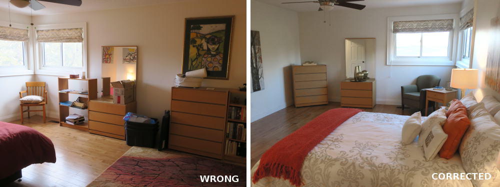
Placing multiple furniture pieces along one long wall makes this space feel cramped and overcrowded. Moving the bed to the main wall creates a focal point and spreading furniture pieces around the room creates better flow and a more open feel.
Proper Furniture Placement – Furniture placement in a room has the ability to maximize the space and also address traffic flow. When getting a house ready for sale, furniture must be placed in such a way as to make the room appear as large as possible and able to hold the right amount of furniture in it while also ensuring easy passage from room to room. While the first inclination is to push all the furniture up against walls or to square it up with corners and walls, those options may not be the best to present the space.
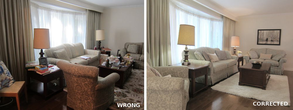
The placement of the armchair creates a hard stop, making the room feel smaller and closed off. By moving the armchair to the side, traffic flow is improved and the room feels larger and more open.
Why?
- Traffic flow: Is it easy for someone to pass through the room without having to get around furniture? The more someone struggles to get through a room, the more that they may feel that the room is too small, especially if they have to zig-zag around items. Any traffic flow areas less than 36” wide are considered “pinch points” and are to be avoided.
- Hard stops: the backs and sides of furniture (eg. dresser, bed, couch, dining chair), when visible when entering a room, can make a room seem smaller. These elements can often appear as “mini walls”, breaking up a space into smaller sections.
- Sharp corners: a room that is full of square or rectangular furniture can appear less inviting. Angles tend to soften the space for a warmer, more inviting space.
- Focal point: by pushing furniture against all walls, a person may lose sight of a key focal point they should notice when entering a room such as a fireplace, window, etc.
- Room shape: furniture should not compete with the way a room is laid out. While most rooms in a house are typically square or rectangular, there are sometimes odd-shaped rooms or flooring that needs to be considered. Furniture should reflect any unusual angles/room shapes that are present in every space.
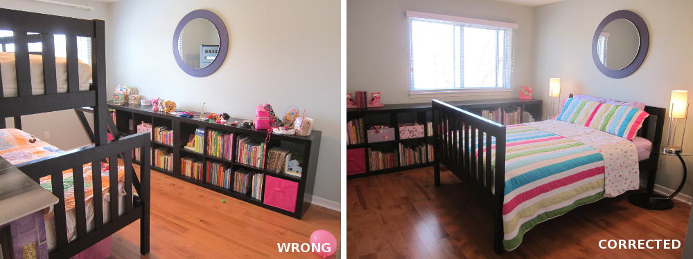
Another example of a hard stop: having to walk around the bed when you enter immediately makes the room feel smaller! (Hint: Bunk beds make buyers feel like the home is smaller and does not have enough bedrooms!)
Some other things to consider for Proper Furniture Placement:
- Furniture height: the tallest item should be placed on the farthest corner of the room to draw the eye in. The room will appear larger when this is done.
- Conversation flow: when people are using furniture, do they need to be facing one another? At a minimum, they probably need to be at a 45-degree angle to ensure great conversation flow.
- Bed placement: while the inclination would be to have the bed facing a window, that may not be the best use of space. Beds should typically be against the furthest and largest wall in a bedroom and be facing towards the entry door.
- Kitchen chairs: diagonal orientation vs. square orientation sometimes helps to show off the space or artwork on walls behind the table.
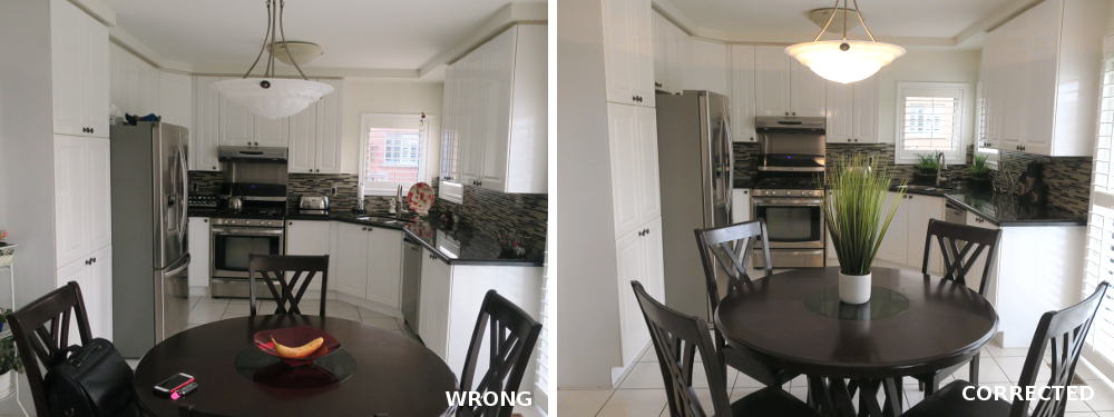
Placing the dining chairs at a diagonal to the walls makes this space feel larger and improves traffic flow.
For more great ideas, click here.
For more unique items for your home, click shopCHT.com
Latest posts by Laurie Usypchuk (see all)
- How to improve lighting - April 16, 2026
- Proper Furniture Placement - April 16, 2026
- Home Staging tips with Mirrors - April 16, 2026


