A bland hotel condo gets shaken and stirred into an intimate pied-à-terre.
Text J. Lynn Fraser I Photography Larry Arnal | As Seen In Canadian Home Trends Spring 2014
Paul’s work is based in downtown Toronto. He chose a 600 sq. ft. condo in a former hotel in the city’s St. Lawrence Market for his pied-à-terre. “I needed the convenience of something central and close to work that I could use for myself and, occasionally, work associates.”
The design concept came from Paul’s elegant style and his desire, as designers Glen Peloso and Jamie Alexander of Peloso Alexander Interiors note, for “007 chic.” “They seemed to really understand the feeling I wanted. I didn’t really have the time or talent to deal with the selections. They ‘got it’ so I let them run with it,” states Paul.
While budget was not an issue for the renovation, the designers observed that, “It’s not always how much you spend on each piece, but spending money on the right pieces that create great results.” They advise, “the elements most used should command the largest part of the budget.”
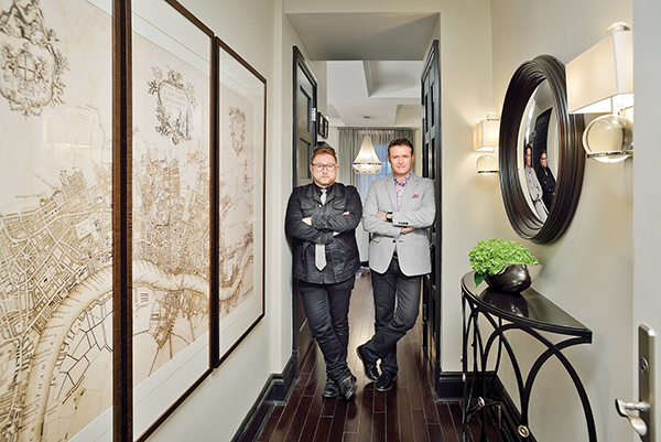
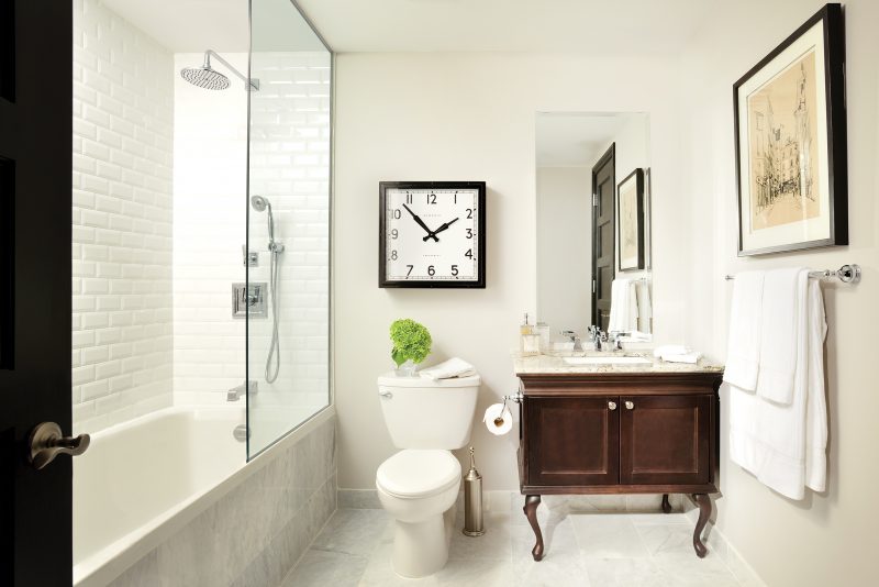
The condo’s original foyer was a typical hotel room entrance with a bathroom on the left hand side. Now the foyer has gone from bland to beautiful. Framed Old World maps, an oeil-de-boeuf mirror, and suede wall covering establish the condo’s gentlemen’s club credentials. The condo’s bathroom brings light with a glass partition. Bright marble tiles visually expand the space. The bold clock and cabinet are statement pieces. Glen and Jamie advise when choosing a mirror for a space to “start with size, shape and balance. Use a piece of cardboard if you are uncertain about sizing.”
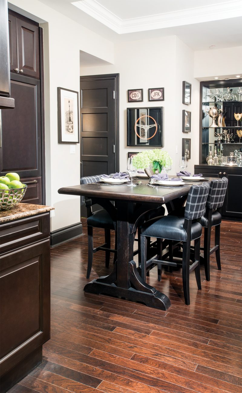
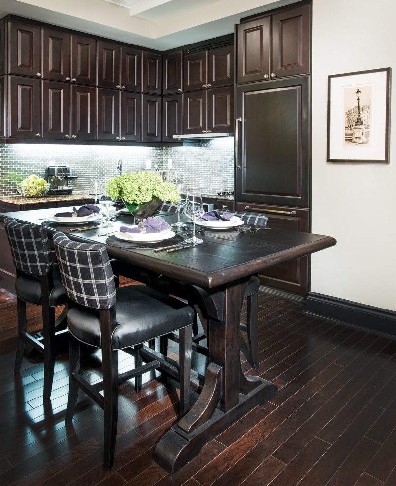
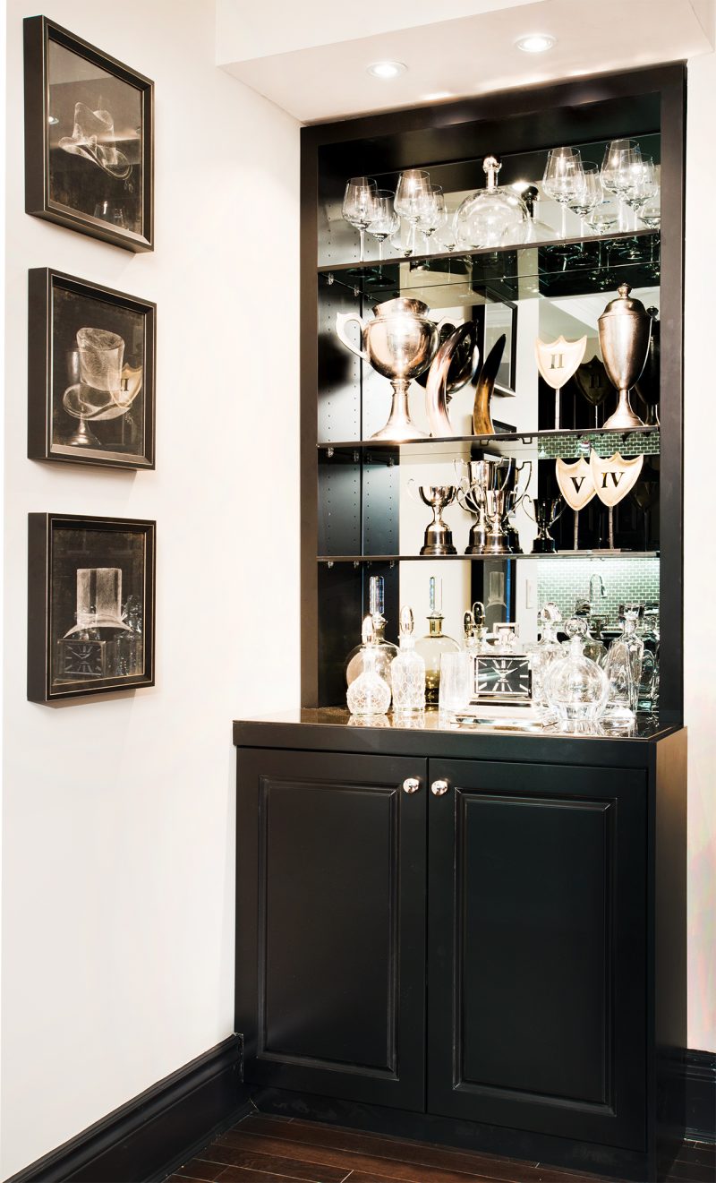
The kitchen/dining area was created for mingling, according to the designers. As per Paul’s instructions, the counter height table and chairs enable a seated guest to sit “at approximately the same eye level as standing guests”. The dark wooden table, window pane and checked fabric chairs further the condo’s masculine elegance. Mirrored cabinets, glassware, and metal sports trophies spark interest and bring visual depth. “The condo is not all that big, and some areas just seemed to be wasted space. I wanted the boys to make them useful and appealing” Paul noted.
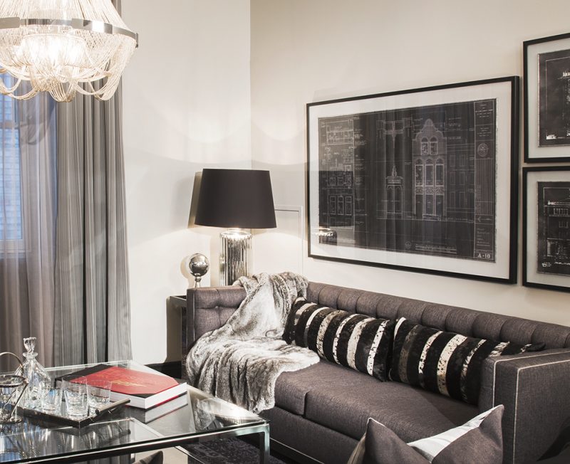
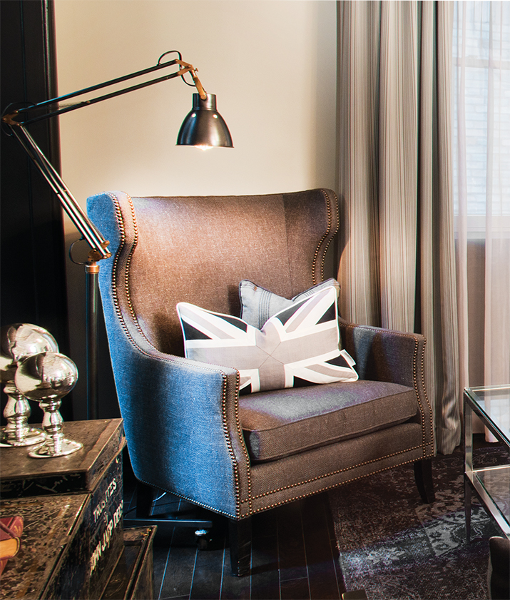
The condo’s 8 X 10 ft. living room is tailored like a bespoke suit. Pewter and soft browns are used in the accessories and club-style furniture. Warm textures, reflective surfaces, and curated layering add intimacy. “Rich colours in a smaller space are perfectly fine provided the space has sufficient lighting. Consider using only two colours in the scheme of the room to make it feel larger,” Glen and Jamie note. “We often tell clients that dark rooms are about lighting not colour.”
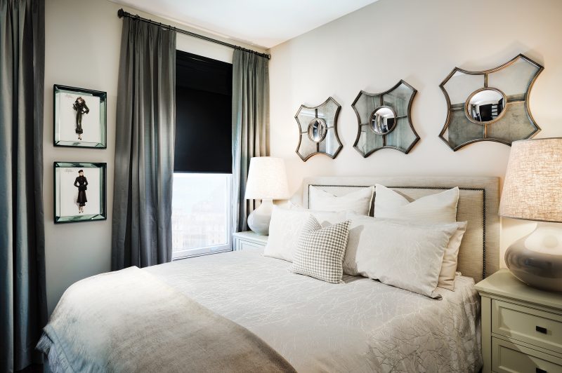
Simplicity enhances the space in the bedroom. The designers used café-au-lait versions of the condo’s colours and materials. Layered linens and textures including mirrored surfaces amplify the room’s light touch. The headboard was custom-made. “The simplicity of the room and the elegance of the finishes, provide the feeling of luxury,” the designers comment.
“I’m not a patient guy but you have to be patient. Design is a process. It does cost some money, but allowing time for the process has an amazing outcome,” Paul states.
Latest posts by Glen Peloso (see all)
- Glen’s Kitchen Must-Haves - April 13, 2026
- 2023 Trends with Designer Glen Peloso - April 13, 2026
- Bathroom Design Tips - April 13, 2026


