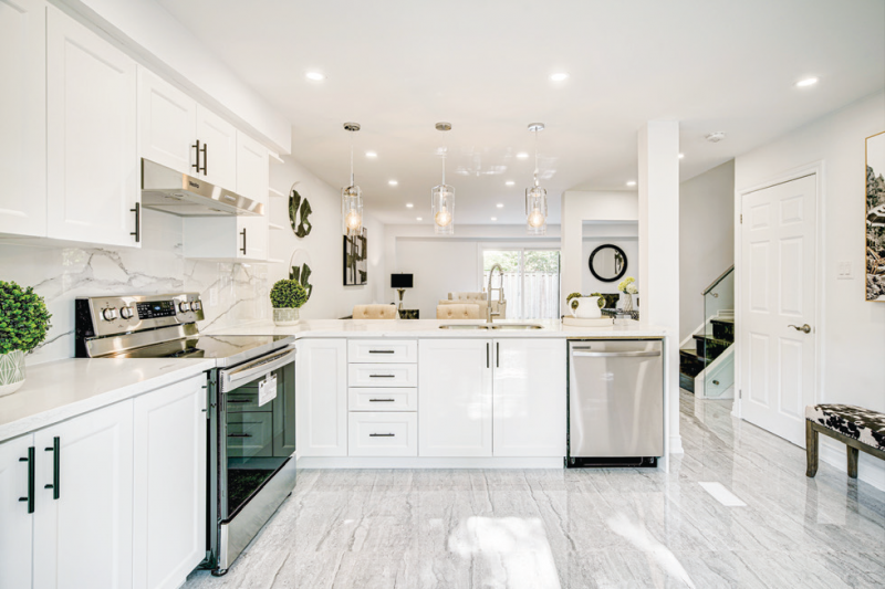
This kitchen’s earthy elements tie in perfectly with the rest of the house. The black hardware on the cupboards creates contrast, and perfectly complements the marble backsplash. The three light fixtures above the peninsula give elevation to the kitchen while keeping the open concept feel.
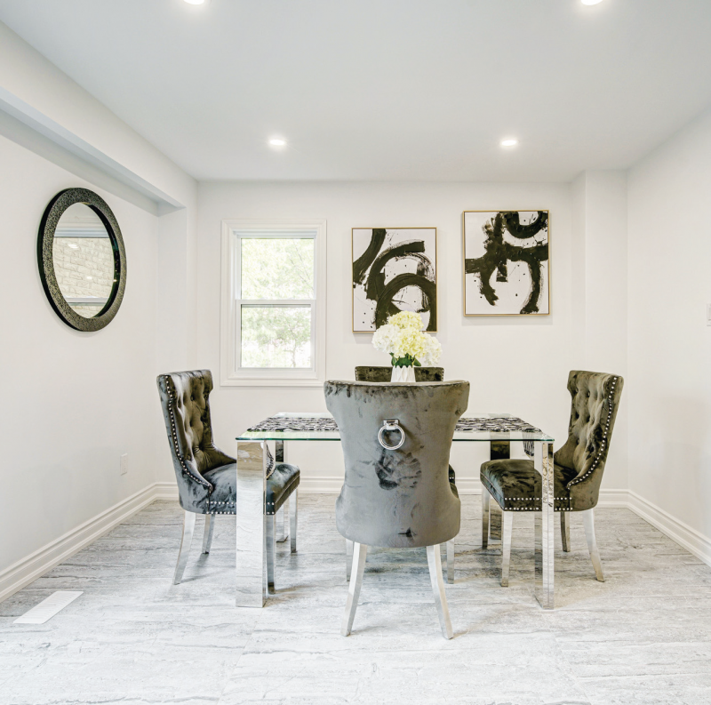
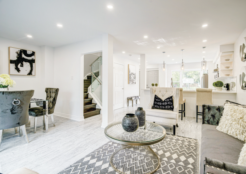
The dining room and living room are located in one large open area, therefore it was only appropriate to bring in a darker contrast against the brighter elements. The metal aspects within the chairs keep the space sophisticated while being consistent with other parts of the room. The paintings on the back wall come to a near match with the photo behind the sofa, again adding to the feeling of consistency. The floral vase centerpiece brings height to the table and creates a focal point within the room.
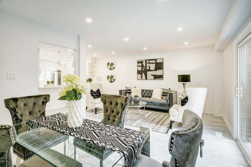
We chose every element of the living room based on the colors and shapes within the rug. The dark contrast creates depth and fills the space. The circular pictures on the left not only bring an almost abstract look to the room, but they also merge the living room into the kitchen contributing to the open concept feel of the space.
SPACE DESIGNED BY Naini D’Souza
www.alphaandomegastaging.ca
TEXT BY Julia Thibeault
Latest posts by Canadian Home Trends (see all)
- 2026 Design Trends: The Evolution of Home Design - April 7, 2026
- Expert Bathroom Design Secrets from Canada’s Best - April 7, 2026
- Treasure Hunting: Discovering Unique, Locally Made & Vintage Home Décor - April 7, 2026


