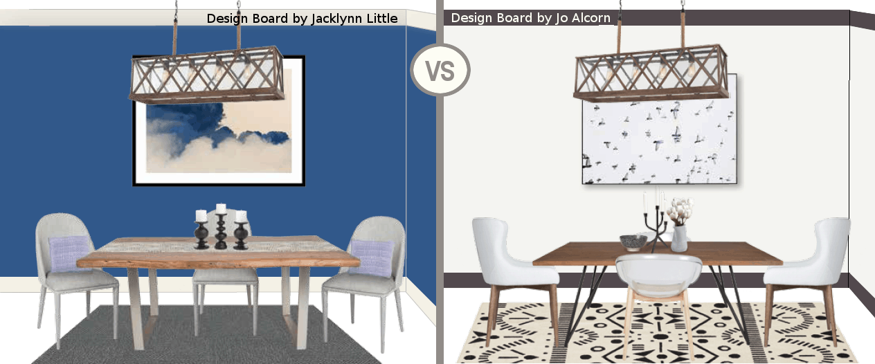
The Challenge: Each designer was asked to create a dining room concept inspired by a gorgeous chandelier from the Lumiere’ Collection by Feiss available at Robinson Lighting & Bath Centre. Based on French countryside influences and a hand-crafted, artisan aesthetic, this chandelier is rich in texture and celebrates a classic lantern silhouette. Cross-hatched, natural oak wood (kiln-dried to avoid cracking and weather well over time) is coupled with seeded glass and rope details to complete the look.
Jacklynn Little’s Look: Jacklynn aimed to create a warm, welcoming space with a dark wall colour to set the mood and a mix of traditional and contemporary pieces for a classic look. (Jacklynn’s design tips and full product sources can be found here.)
Jo Alcorn’s Look: Jo embraced the fantastic combination of wood and black in the chandelier to create a space that is elegant and balanced with just the right touch of drama. (Jo’s design tips and full product sources can be found here.)
Which look do you prefer? Let us know below and you could win the Lumiere’ Collection chandelier for your own dining room!
Latest posts by Canadian Home Trends (see all)
- 2026 Design Trends: The Evolution of Home Design - April 29, 2026
- Expert Bathroom Design Secrets from Canada’s Best - April 29, 2026
- Treasure Hunting: Discovering Unique, Locally Made & Vintage Home Décor - April 29, 2026


Jo Alcorn’s Look is very inviting.
My life is incomplete whithout a massive chandelier somewhere in it !
They are all so beautiful. I vote for Joe Alcorn’s Look
Jo Alcorn used the chandelier for her inspiration, and her room gets my vote .
Jaclyns – much nicer!
Jo Alcorn’s Look is very cool
Jacklyn’s look
nice
I like the strength of the solid colours but the whimsical nature of the prints. I vote for a mix of the two. Here’s hoping that the chandler ends up in my home.
Thanks for giving.
Besos, Sarah
Journeys of The Zoo
Jo Alcorn’s look is for me.
I like Jo Alcorn’s look
beauty
I vote for jacklynn because her design was very inviting and made me want to sit down at her table and have a amazing meal. It wasn’t busy and I feel really happy and confortable. In life we just want to relax and enjoy after a long day.
i prefer Jo Alcorn’s look
Jaclyn’s look. Love the color on the wall.
i like jo alcorn’s !
i like joe alcorn’s !
I like blue I vote for Jacklynn’s design
I vote for Joe Alcorn’s look.
Jacklynn Little for sure.
Alcorn’s
Jo Alcorn’s
Jo Alcorn’s look is my fav…makes you want to open up your conversation!
Al’s
Joe Acorn’s
I vote for JacLyn,s design
I like Jo Alcorn’s look
Jo Alcorn’s room design is fabulous!
i prefer the contrast and look that Jo Alcorn has created.
LOVE THE STYLE
I vote for jacklynn, I like more of the wood.
Loving Jo Alcorn’s use of colour and texture. Works so well with the rug below.
That chandelier is amazing!
I voted for Jacklynn Little’s design!I find this look is exciting but also comforting! I have all fingers crossed for my dining room to be alight with the beautiful Lumiere’ Collection chandelier!!!
Love the play of patterns in Jo’s look. Very unique
I voted for Jo Alcorn’s nook. That light!! <3
I love Jacklynn Little’s look!
Out of the two-as one is very empty and bland…the blue room is semi inviting. They both are missing a lot. The both symbolize the same contemporary look~where is the comfort/neutral environment? Just say’n…Live~Love~Laugh xo’s
I love jacklyn’s contrast with colour. Sets off the shape and facets of light.
Jacklynn’s is warmer. I’m not a fan of white walls.
Although my eyes immediately settled on Jo Alcorn’s design, I found it a bit too clean and lacking in warmth for my taste. I vote for her design with wall colour on the white wall behind the table to add some depth and warmth. My choice would be one of the colours in the carpet or even a tinted hue pulled from the chandelier. The design of the chandelier is lovely, open weave and boxy but elongated to create a gentle elegance. Beautiful.
Jo Alcorn’s cleaner, lighter look is a winner.
I like Jacklynn’s look
Jo Alcorn’s design is my decor of preference. I love all nuances of whites and creams and feel the happiest in a light and airy room. The darker chandelier adds just the right amount of balance to the room, while grounding the like coloured table and chairs. As we are in the depth of winter now…a bright, cozy room would lift my spirits : )
I like Jacklynn Little’s Look
Jo Alcorn wins my vote! Love the simple design and the use of white on white colour palatte. The design in the area rug and artwork balance well with the beautiful lines of the chandelier.
I liked style #1 of the kitchen. Thank you for this contest…
The decor in Jo Alcorns’ is my style. Love the lighting.
Jacklynn’s look is the one I pick
I prefer Jacklynn’s design. Because the dining room fixture has weight built into its handsome look, it requires balance in the room. The dark wall and rug offer a warm and supporting background for the light fixture. In this way, it does not overwhelm but compliments the rest of the room.
They’re both great but my vote goes to Jacklynn Little
Jacklynn Little is my pick. The other is too antiseptic.
I like Jo Alcorns.
Jo Alcorn’s Look is very cool
I like Jo Alcorn’s the most.
Jacklynn’s look