The recent International Contemporary Furniture Fair in New York was a pleasure and it was interesting to see what the world brought to the show.

Some of the offerings were filled with an obvious effort to be “different” resulting in perhaps an art piece but an uncomfortable seat. On the other hand there were many things that were truly beautiful as well as being innovative. I had a nationalistic pride to see a company called Diamond Stairs from Vancouver who created a kit for a floated wall mount stair case. Daniel Meier, who created the system, was so often asked for this stair case application, he decided there must be a way to create it easily and came up with this system; not exactly furniture but still a highly contemporary look.


There was also a serious focus on recycling and energy consciousness. There were a number of furniture pieces made out of eco friendly materials and a huge amount of recycled wood products. A stand out for me was a Seattle company called Gray Pants. They started to collect cardboard from the streets of Seattle and using a laser cut technique, created some really beautiful lamps. The overall look is somewhat rustic but nonetheless beautiful. Who doesn’t like a great lamp with a good feel good story?
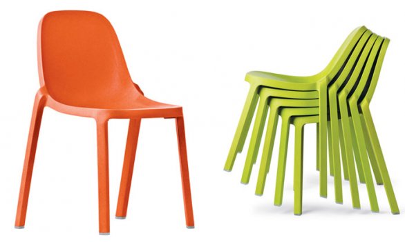
I, along with many other designers, have always had huge admiration for Philippe Starke for his ability to create new designs based on problem solving. I visited his hotel in Paris last year (Mama’s Shelter) and loved the simple practicality of the space and for approx 80Euros a night, it was also easy on the pocket book. With Emeco, he created a series of chairs called “Broom” which were featured. Made of ninety percent recycled materials or the left over materials from the creation of other products, called “Broom “because they are created from what was swept up from the floor! His understanding of both the production process and his understanding that our need for consumption will eventually tap out our natural resources, make him a good fit for this kind of work. The Broom chair is simple, functional and unselfconsciously beautiful.
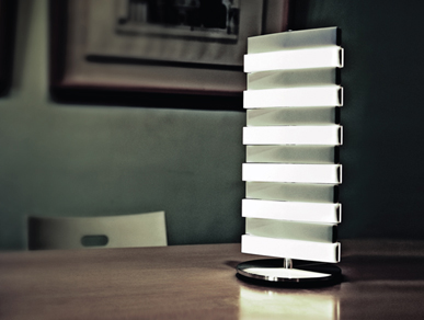
It’s also pretty clear the world of the LED light is here to stay. As I’m sure many of you know the LED light consumes far less energy than an incandescent bulb. As a simple way to understand the consumption difference; one could pot light the main floor of a house for a year, for approximately the same energy consumption as burning an incandescent night light for the same period of time. They also last far longer than a regular light bulb (approximately twenty thousand hours of life or twenty years) With that thought in mind, the Piano light by Qis Design offers lamps where each bar of the fixture, “lights” when you depress it, so that you can have them all on or just one.
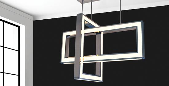
Nuvo Lighting from NYC stepped that idea up a notch with the “Geocentric” fixtures made of LED light circles, squares and crosses that not only emanate light for the room but are also great sculptures in the space at the same time. These fixtures have the ability to change the angles of intersection with pivot joints. The innovation and the fact that the fixture embraces the LED, without trying to mimic the classic “light bulb” made me want to stop and have a good look!
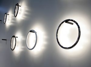

It wasn’t long before I was standing in a group of people looking at an LED ring, hung on a post in the Humanscale booth. What made this prototypical light fixture intriguing was that it was functioning with no relation to the post, or any connection to the post at all. The two elements communicate using radio waves and magnetic energy hence — no electrical source. I had more questions than answers about this technology, but certainly innovative and perhaps a game changer in the world of lighting or it will be back to the drawing board – we can only wait and see.
You should also keep your eyes on the world of wall paper. While I like to work with “Prime Walls” in Toronto because they offer so many tactile papers that are as much fun to touch as look at, every country from around the world had a wall covering.
Tiles were also shown in a variety of shapes from 3 dimensional bubbles to pyramid shapes, and three dimensional woven patterns in ceramic. Alsio Designs in NY had me rubbing my hands all over the walls to experience the shapes and textures which also incidentally provide you with fantastic opportunities for light and shadow with the product. I also love the Murals available in a predominance of old world images. Simple painted walls didn’t seem to have much presence.
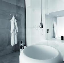

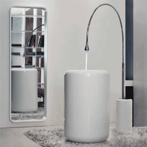
Gessi which is known for first quality bathroom fixtures showed a sink and faucet combination called Goccia which was amazing. The faucet, either floor or ceiling mounted, featured a “drop of chrome” at the end of a tube and the water aspect had the same beauty and grace as the Arc lamp does. Definitely put a smile on my face.
Latest posts by Glen Peloso (see all)
- Glen’s Kitchen Must-Haves - March 17, 2026
- 2023 Trends with Designer Glen Peloso - March 17, 2026
- Bathroom Design Tips - March 17, 2026

