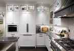
Although their old kitchen was three times the size, with strategic planning and design we were able to create a more functional new kitchen in a much smaller square footage.
The Staircase
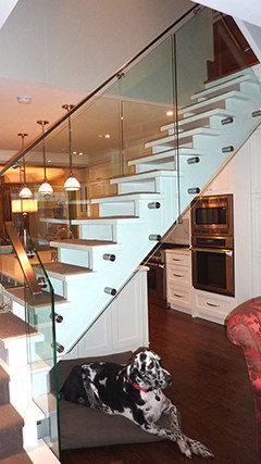
Now that we had a beautiful new kitchen to feature, something had to be done with the awkwardly positioned staircase. A fresh coat of white paint was applied to the risers and we replaced the heavy spindles with sheets of glass to allow a view through to the rest of the space. An aluminum railing picks up on the metal accents throughout and provides a modern focal point within the more traditional home. As in many older homes the existing Oak panelling was installed half way up the wall instead of the more visually appealing “rule of thirds” composition. To help disguise the awkward proportion and to save the cost of removing the wood panelling we chose to paint it out the same silvery taupe as the walls. Although their old kitchen was three times the size, with strategic planning and design we were able to create a more functional new kitchen in a much smaller square footage. Our clients love the new space and tell us “it’s the best kitchen we’ve ever had” and it is truly loved by family and friends. - Text by Renee Gammon of Sealy Design
Latest posts by Canadian Home Trends (see all)
- 2026 Design Trends: The Evolution of Home Design - April 1, 2026
- Expert Bathroom Design Secrets from Canada’s Best - April 1, 2026
- Treasure Hunting: Discovering Unique, Locally Made & Vintage Home Décor - April 1, 2026


I love this kitchen – what a fabulous use of space!